
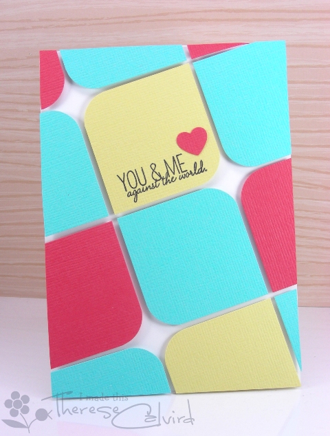
Here is another card that I had published for the Australian Cardmaking, Stamping & Papercraft magazine. I had so much fun with this one, the theme was ‘colour blocking’ and I totally adore these colours together.
Hope you have a great week planned. I’ll be back soon.


Other Supplies:
 | | |
|  |  |
| |  |
 | |  |
|

This is one of the best color blocking cards I’ve ever seen! I love how you tilted the design!
My eyes just popped seeing this SUPER AWESOME card!!!!
What a great idea. TFS.
Wow! Awesome color blocking, Therese! I love the color palette and your design is really amazing! Congrats on your well deserved publication, too!
Wonderful, these colours do look fantastic together!
Great card. Love it xx
Such a gorgeous card – love these sweet colours together! xL
This is so cool, Therese! I may CASE this idea from you…
I love that you have put this on a slight angle, very cool!
YES! The angle really brings this up a notch 🙂 Love these colours together – the soft yellow sets off the bright colours beautifully. Enjoy your busy time!!
Stunning card, Therese! Great colours – I rarely think of going with the ‘basics’ when I have the patterned papers calling. Definitely need to give this a try! Have a wonderful Monday – and thank you for sharing!
c
Love!
Love your very graphic card Therese 😉
THank You~
Killer gorgeous! Love that bold, bright color blocking!! And all set on an angle too…this is just amazing and so darn clever. Love this. : )
This is the funnest CBC, Therese!! Congratulations on another publication!!
Perfection!
Clever & fun–no surprise they published it!
Awesome! These colours work so well together!
I am SO in love with this card Therese!!! the colours are amazing and the design is just perfect! 🙂
wow what a cool designed card.. i love it
This is such an awesome card!