
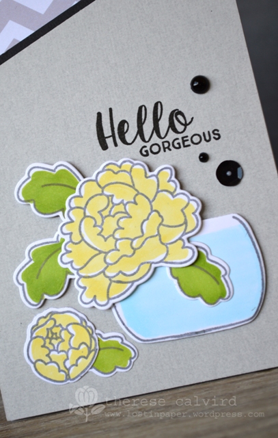
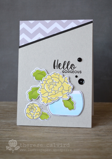
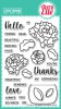
A quick publication share today (I thought that I had already posted this card but can’t find it… or the card post I pre wrote, so I am not sure what is going on)…. Anyhoo, my card today is all about No Fuss Copic colouring, so I didn’t blend any of the colours and decided to leave just a small highlight by not colouring all the way to the edges. I made this for the Australian Cardmaking, Stamping & Papercraft magazine. BTW the grey’s do look similar IRL, they just didn’t photograph so well, or was it, I didn’t photograph them so well… Oh, well.
I’ll be back on Wednesday with a video for Altenew, I look forward to seeing you then.

Other Supplies:
 | |  |  |
 |  |  |  |
|  |  | |
 |  |  |  |
 |  |  | |
No fuss, love that! It makes me think of the waffle flower look, easy peasy colouring with great results…Beatiful!
That’s my kind of Copic colouring – thumbs up!
Ooh! I LOVE the boldness of the black against the softness of the white here Therese, and yellow always goes beautifully with grey! That patterned corner makes the whole thing a real knockout! Have a very lovely Sunday! Hazel xx
My Card Attic
Fabulous design, Therese! One can never go wrong with any shade of grey, in my humble opinion!
=]
Love this type of colouring – I can manage it – LOL
Beautiful card Therese – congratualtions on it’s publication!
Until Wednesday then – ciao!
Lovely card, clean, simple and elegant all wrapped up in one card.
Congrats on your publication! Beautiful Copic coloring…love the simplicity, and your design is gorgeous, Therese!
Congratulations on your publication!
Such a cool design! Congrats.
This is a very pretty card. I like your no fuss coloring! The open white space does add a lot, I am goingn to add this to my list of things to try.
I do find that certain cards are very difficult to photograph. It looks lovely here!
Just lovely, Therese … love the soft yellow and grey colour combo! Congratulations! Hugs, Anita 🙂
Nicely done. It goes to show that sometimes less is best.