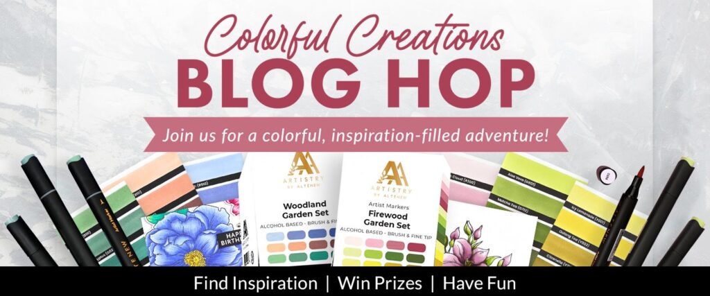
Are you up for the Alcohol Challenge… Alcohol Markers that is 😄? Today, I am challenging 2 new sets against each other!
But first, I wanted to let you know that this post contains a ton of affiliate links (at no extra cost to you – just in case you decide to go shopping 😉) and that this post is part of a Hop celebrating a new release from Altenew and you can find all of the hop details in the link list below!
#ALCOHOLMARKERS
There is nothing more exciting than adding some new colours to your collection. Altenew have added 2 NEW sets of markers and the colours are dreamy. Today, I decided to ‘Challenge’ the marker sets against each other and share how they can be used independantly… just in case you need to choose. Don’t be afraid to mix and match your markers to get more from them!
Are you a BRIGHT’s or a MUTED colour person? Check out today’s cards.

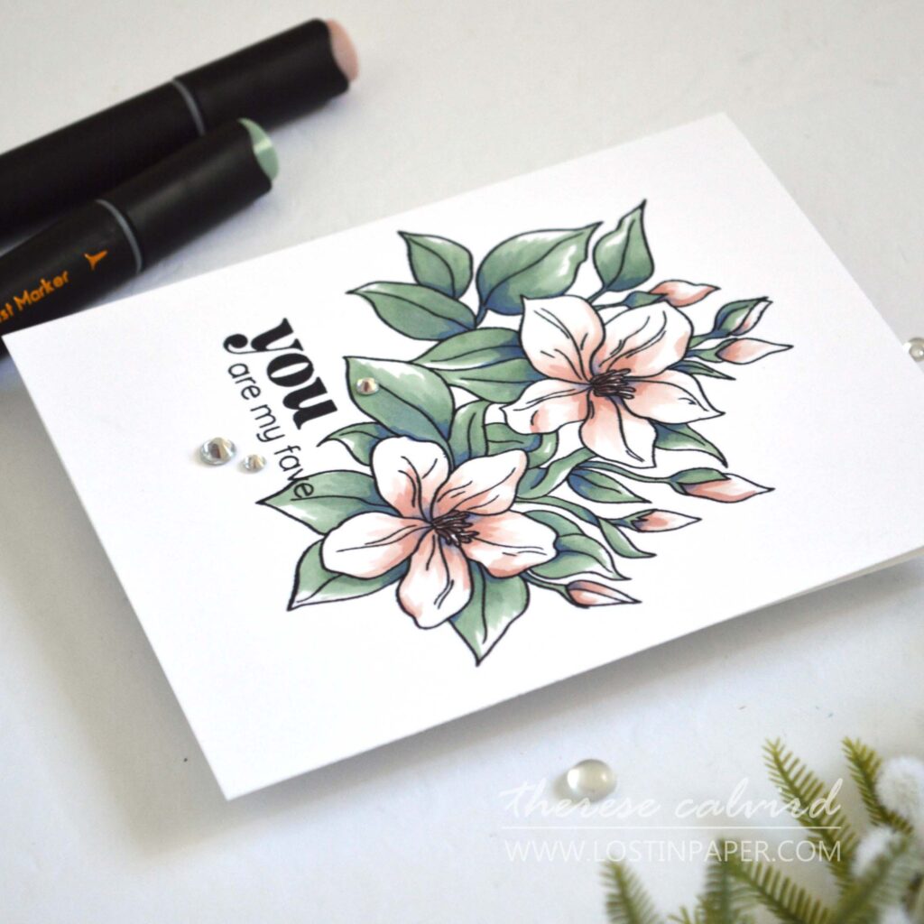
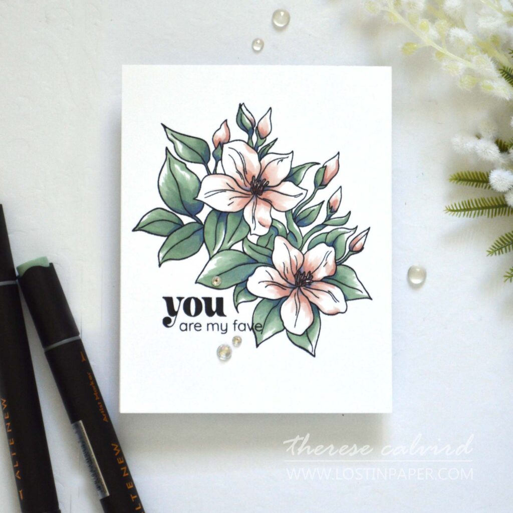
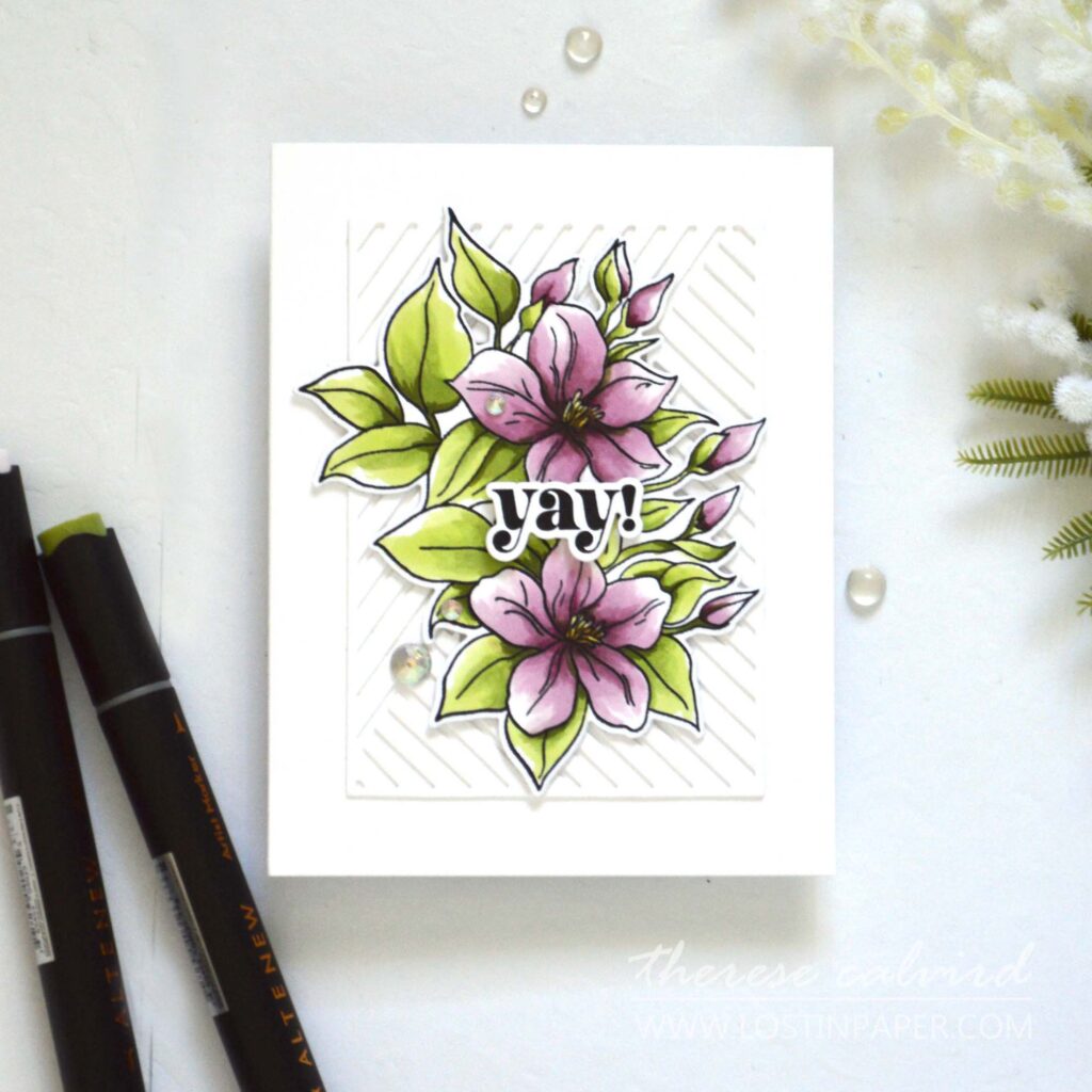
Card #1 – Woodland Garden SET L
I surprised myself with this set… I thought for sure I was going to prefer the ‘brighter’ pink set of markers, but the winner for me today was the Woodland Garden with its muted colour palette and subtle tones. 
Don’t get me wrong, there are also bold colours in this set so it would be easy to change up the look, but for today I focused on the lighter colours.

To make the comparison easier I used the same bouquet from the Sweet Jasmine set and made this the focal point on both card designs.
PRO TIP: Need to add shading but don’t have any grey tones? I used some of the blue shades included in the set to add shadows to the leaves and petals (don’t be shy).
#Pantone2024
Altenew are right on point with this colour combo, did you know that the Pantone colour of the Year for 2024 is Peach Fuzz, and for a ‘brights girl’ I am loving it!
Card #2 – Firewood Garden SET M
This set reeks of Florals. Perfectly coordinated with the bright purple pinks, brighter greens and pops of yellow… or you could use the yellow for the petals instead. So many options.
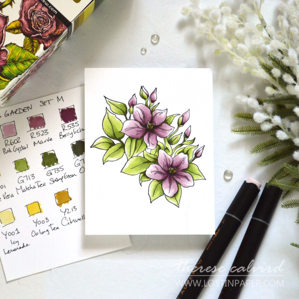
I mostly used the lighter colours again here and for the shading this time I used some of the greens, but you could also use one of the pinks to get shadow on the leaves.
PRO TIP: I always keep a scrap of white cardstock beside me to test my colours and shading as I am colouring.

I kept both designs clean and simple as I wanted to focus on Alcohol Markers today. But I couldn’t help myself, I am addicted to sparkle so I did add just a little bling to the cards.

Giveaway Prizes
$300 in total prizes! To celebrate this release, Altenew is giving away a $100 gift certificate to 1 lucky winner and a $25 gift certificate to 4 winners! Please leave a comment on the Altenew Card Blog and/or each designer’s blog post on the blog hop list below by 03/03/2024 for a chance to win. Altenew will draw 5 random winners from the comments left on each stop of this blog hop and announce the winners on the Altenew Winners Page on 03/05/2024.
*The winners of the $100 gift certificate will be chosen from comments left on the Altenew blog.
Let’s Hop
I hope you enjoyed these designs and are inspired to get those alcohol markers out. And, let me know in the comments below which is your favourite colour palette today, the Woodland or Firewood Garden?
Crafty Hugs,

Other Supplies: SHOP the New RELEASE HERE
Altenew Alcohol Markers – Woodland Garden SET L – R910 | R912 | R111 | R112 | G111 | G023.
Firewood Garden SET M – Y001 | Y213 | Y225 | G801 | G713 | G735 | R300 | R602 | R523 | R535.
 Woodland Garden Set L ALT | SSS |  Firewood Garden Set M ALT | SSS |  Neenah Solar 110 AMZ | SSS | AUZ |  Neenah Solar 80 AMZ | SSS | AUZ |
 Sweet Jasmine Bundle ALT | AUZ |  Sweet Jasmine Stamp ALT | SSS |  Sweet Jasmine Die ALT | SSS |  Mix and Match Frames Die ALT | SSS |
 Permanent Black ALT | SSS | AUZ |  Obsidian ALT | SSS | AUZ |  Crystal Clear ALT | SSS | AUZ |  Iridescent Crystals ALT | SSS | AUZ |
 Tweezers ALT | SSS |  Fine Blade Scissors ALT | SSS | AUZ |  Scissors SSS | AUZ |  Stampwheel ALT | SSS | AUZ |
 Stampwheel Square Grid Flip Plate ALT | SSS | AUZ |  Score Board ALT | SSS | AUZ |  Paper Trimmer AMZ | SSS |  Bigshot SSS |
 Satin Masking Tape ALT | SSS | AUZ |  Bearly Art Glue SSS | AUZ |  Glue Tape ALT | SSS | AUZ |  Foam Tape ALT | SSS | AUZ |

I’ve got to agree that first cards colours are just gorgeous.
Loved them both the compositions very much though.
Yes you’ve convinced me, I need these new sets lol.
Cheers my friend.
Both cards are beautiful! The Firewood Garden colors are my favorite!
I’m no help – I got both. Lol. Love the way you challenged them and in love with that background coverplate.
Wow! The cards you colored using these sets of markers are gorgeous! I want both sets but I guess if I had to choose just one it would be the softer shades set.
The are lovely colors in the new Altenew markers. They seem very subtle and blend beautifully.
Both cards are beautiful! Great tip on keeping a scrap of white cardstock nearby to test your colors and shading as you color!
Absolutely STUNNING! Love both cards and the colors on your first are so soft! These markers are really wonderful. I would have never known if it wasn’t for this Hop. I always use Copics but now I may have found me some NEW markers!! Thanks for sharing and opening my eyes!!
I love both color combinations! Lovely cards!
Your coloring is so wonderful, Therese. I need to practice more with my markers.
Hi Therese. Your cards are colored so beautifully. I like that you used Sweet Jasmine on each card so we can really compare the colors. Thank you for sharing the tips on shading. That was very helpful. The die really sets the background off nicely. I am looking forward to your next project.
I love the two different takes on the colors and your coloring is amazing! I can’t pick a fave, I like them both!
So soft and Lovely!!!! Beautiful colors!!!
I must be both, Therese because I love both of your fabulous cards!
So pretty. I love the muted colors (Woodland set) of the first card. I loved that you did a comparison.
I just love these C and S cards and the color combinations make them so refined and elegant. Thanks you for sharing! These markers are definitely on my wish list now.
Love your cards! Your coloring is wonderful and the colors are perfect! Thank you for sharing!
These new markers from Altenew look fabulous, and your inspiration is amazing. The style of each card is so stunning and your blending is done flawlessly. Lovely inspiration from Altenew once again. Thanks for sharing your talents.
Lovely designs Therese. I just got the stamp set, might have to try with other markers while I get the new sets 🤩 Thanks for the inspiration!
Both look so pretty. I especially like the one on the left. So nice!
I can’t decide which colorway I like better. Both look great.
Beautiful designs Therese! The colors of these new markers sets are very pretty and a must add to the collection. Thanks for the inspiration!
I love the new colors and your “challenge” was a success. I love the BOLD and bright combination, but the muted is so lovely and soft– I want BOTH sets! 🙂
My rationale is, if I buy these markers, I will miraculously become a better alcohol marker colorist. Logical, right?
Thank you for breaking my crafting budget!
I can certainly see your logic, because you can’t get better at colouring with these markers if you don’t have them (wink). ps sorry about the budget lol.
These are beautiful, soft, subtle cards! Love!
The cards are just beautiful, and although I’m a bright color girl…those softer colors are do die for!!!
Pretty colors and nice techniques used for shading
Beautiful color for the flowers. Nice tips shared for creating with the sets.
Thank you so very much!
Your cards are absolutely gorgeous. Love your colors.â¤ï¸
I’m in love with both cards and color choices Therese. Either way you’ve created two gorgeous cards! I’ve tried out these marker sets and found the lighter colors a bit easier to blend, so I appreciate seeing your coloring and suggestions for shading!
I guess it depends on how I feel at the time, go bold or soft and dreamy? After seeing your cards that are so striking, I want to do both.
Love both cards. So pretty!
Beautiful cards, Therese! Thank you for sharing the idea to use blue for shadows. So helpful and I wouldn’t have considered it on my own.
Love the comparisons.
Awesome coloring
Great coloring. Really like the bright greens in the Firewood Garden set.
Beautiful cards! I am definitely loving the brighter tones of the Firewood Gardens.
Both cards are fabulous for sure. Maybe the muted is my little more favorite today. They look so much like watercolor to me. So beautiful and inspiring â¤ï¸
I love your coloring. It has an organic quality that reminds me a little of watercolor! Beautiful!!
I really appreciate that you opted for a more muted approach since so amny of us automatically go for the intense options. Lovely results
These cards are so sweet! Must admit I like the sparkle. Now, I think I will have to add these markers to my stash.
Absolutely gorgeous
I love both of your cards. Your coloring makes the flowers look so delicate and light and airy. Beautiful!
These are both really pretty, but I love the background you have in the yay card. Great job on these.
love your color swatch cards – what great IDEA! 🙂
LOVE your COLOR SWATCHES – What a great IDEA! 🙂
Gorgeous cards and I love to see each of these beautiful colors used. Definately need both of these sets!
Love all of these and the gorgeous ways you used them for the flowers!
Your blending is just gorgeous! Your color choice is spot on. Very nicely done
Beautiful cards! These 2 sets are a must have to add to my collection!
Love the subtle pop of color on the white floral.
Therese,
Beautiful cards, both equally gorgeous!
I hope to get these new marker sets and try to color like you. 😃 Great stamp set too.
PsðŸ˜ðŸ˜¤ I couldn’t comment on Michelle’s post, I tried and tried. â¤ï¸
These are both beautiful.
Love the muted colors!
Your cards are beautiful, and the soft colors makes the cards elegant. I love the colors you used and I am sold on these markers!!
My favorite is the brights, pretty cards
Really beautiful cards with great color choices!
These are so gorgeous! You are my fave is one of my daughter’s favorite things to hear – LOL! It’s like a sweet joke we have between us 🙂 Thanks for the memory and smile!
Gorgeous! As always amazing colouring . Definately brights for me!
Beautiful (as always!!)! Love the card and colors!
Beautiful (as always!)! Love the card and colors!
Beautiful!!
The Woodland greens are really growing on me even though I already have lots of that color family.
What a lovely card! Great dimension and of course, coloring!
Contemporary, delicious colours and exactly perfect ! xx
I know right, these colours together make me happy!
A little late to the party. 🙠Both cards are beautiful and great comparison.
What a mind blowing set of cards you mde there. Your color composition is soothing.
Both color palettes are divine! I cannot choose a favorite as they both are equally fabulous! Of course, a little bling and a little sparkle never hurt anything–only enhances the beauty already there! These are just lovely!
Gorgeous cards, beautifully colored!
Your cards are so pretty, Therese! I struggle when it comes to leaving white space but it really does make a difference. I look at a real flower and see solid colors, so leaving white always was difficult for me. I’m going to keep trying!
Hi there, I totally agree with you, white space on flowers can be difficult to judge and sometimes I miss it totally (if I get too overzealous colouring lol). Thanks so much for stopping by and taking the time to comment. Crafty hugs, Therese x
Beautiful cards and colouring! Your designs highlight the flowers so beautifully!
Love the design and colors! Lovely card!
Gorgeous cards with gorgeous coloring using these lovely new alcohol marker colors!
Beautiful cards with two great looks!
Love the “clean and simple” aesthetic.
Beautiful softly colored cards!
Beautiful layering and coloring.
Love the coloring on both cards, this pastel shades are you
Lovely cards!
Beautiful cards! I love seeing the new color families on two different cards.
Here’s what amazes me…no matter what medium you’re working in, the colors on your projects turn out amazing! Thanks for sharing you gift with us, Therese.
Beautiful cards, Therese.
Love your work. Curious if you have any tips on coloring with alcohol markers, you mentioned a few within the photos. For the pinkish floral did you just use the 2 lightest colors and blend them out and leave mostly white space? I also will try adding blue to my leaves…liked that tip. Thanks for your post.
Yes, I really must do some more colouring soon, so glad you enjoyed the cards. I have quite a few colouring videos at my Youtube channel. There is a playlist but I would probably start with this one here
https://youtu.be/CFX0ae02uOM?si=cDPrljbEZ4c14Nnv
ps yes I do love some white space when I colour leaves and petals.
Your cards are beautiful! I love the colors of these markers and wish I could afford them. I am such a fan of all your work!!
You are so sweet, thank you Dana!