
Do you struggle mixing colour combos? Today I share some fun hacks to make an easy colour combination and how you can change it up!
But first, I wanted to let you know that this is part of my Take 2 Series with Altenew and I’m so excited that you are joining me for another video today.
Would you like to see today’s cards?
You can see the video below or watch it HD at YouTube.
I use affiliate links, this means that if you click on a product that is linked to an affiliate shop then I will receive a small portion of the sale at no extra cost to you).
This is a great way to support my channel as well as the shops that I love!
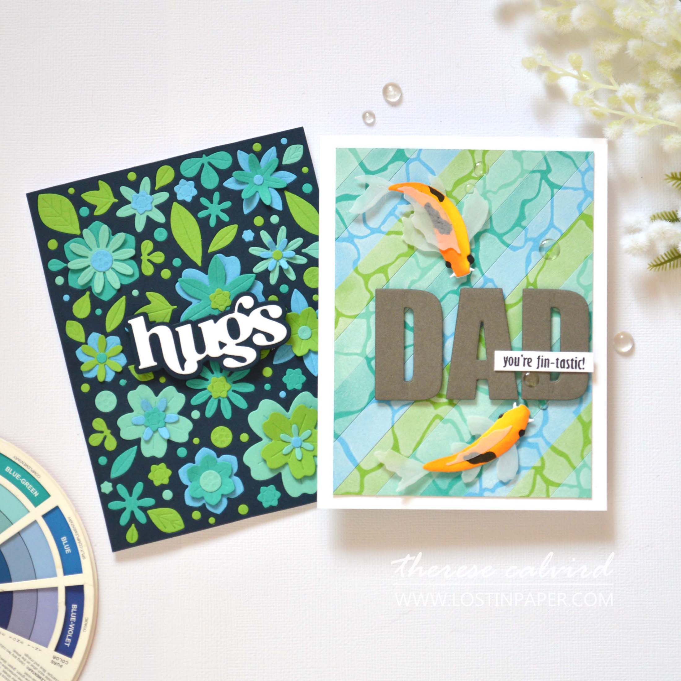
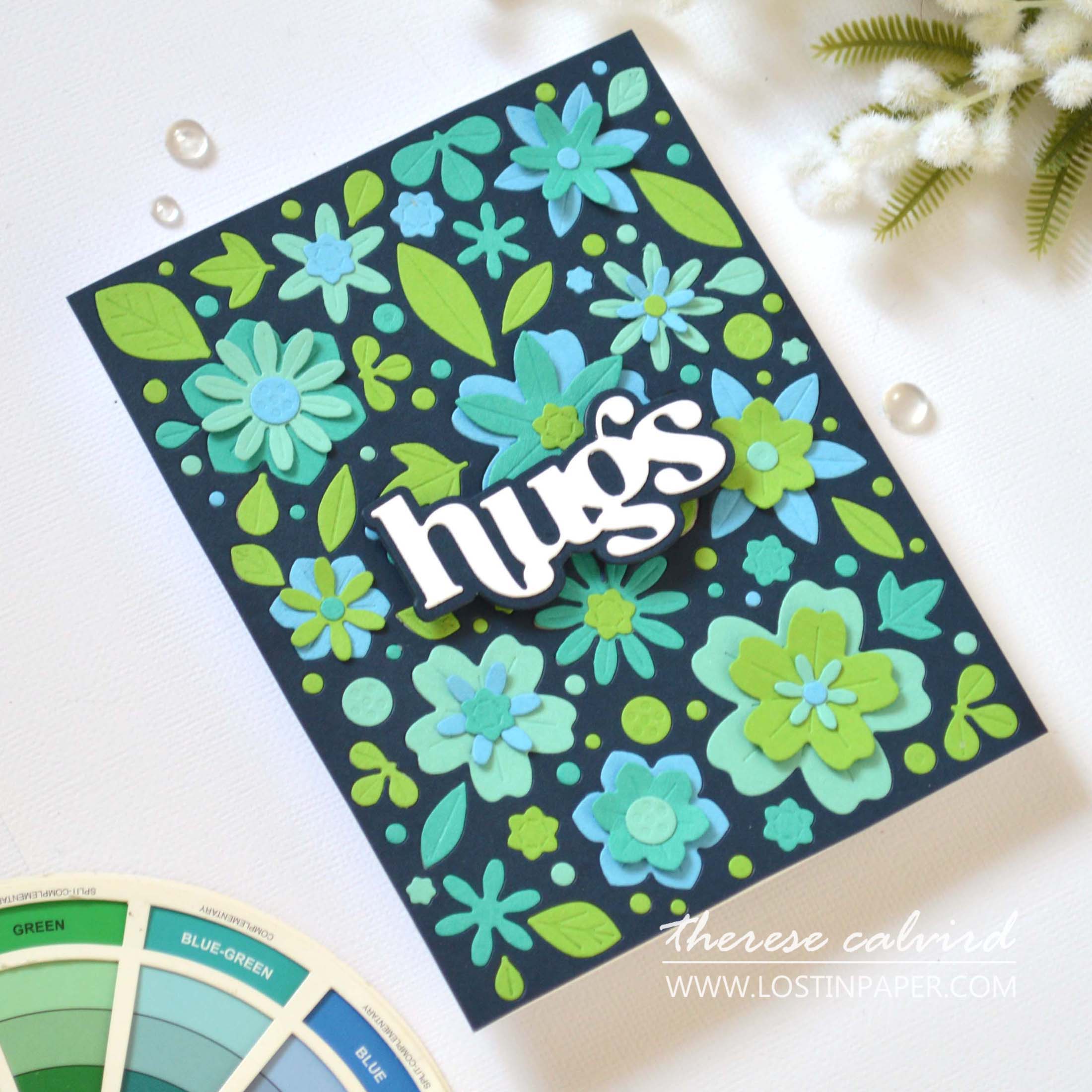
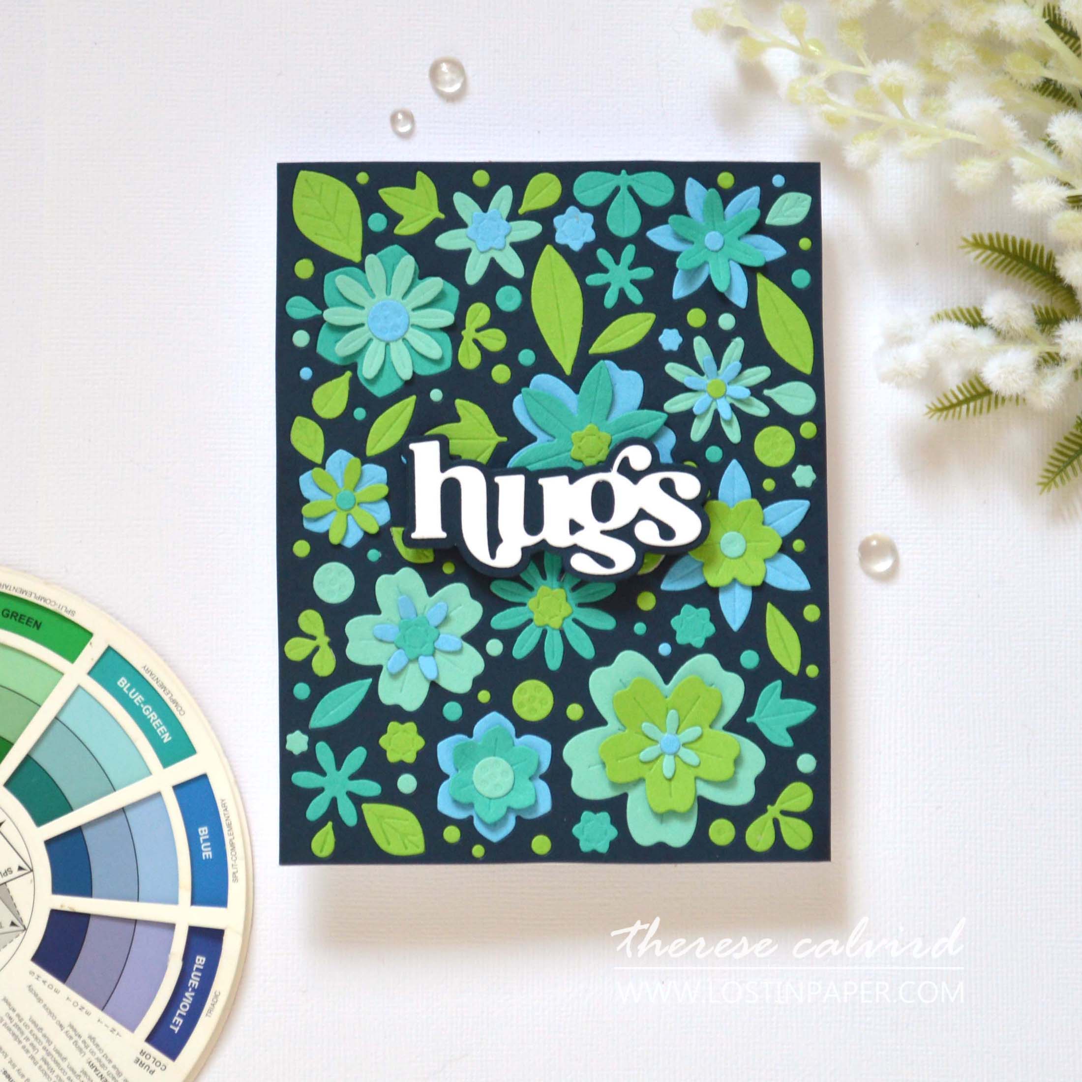
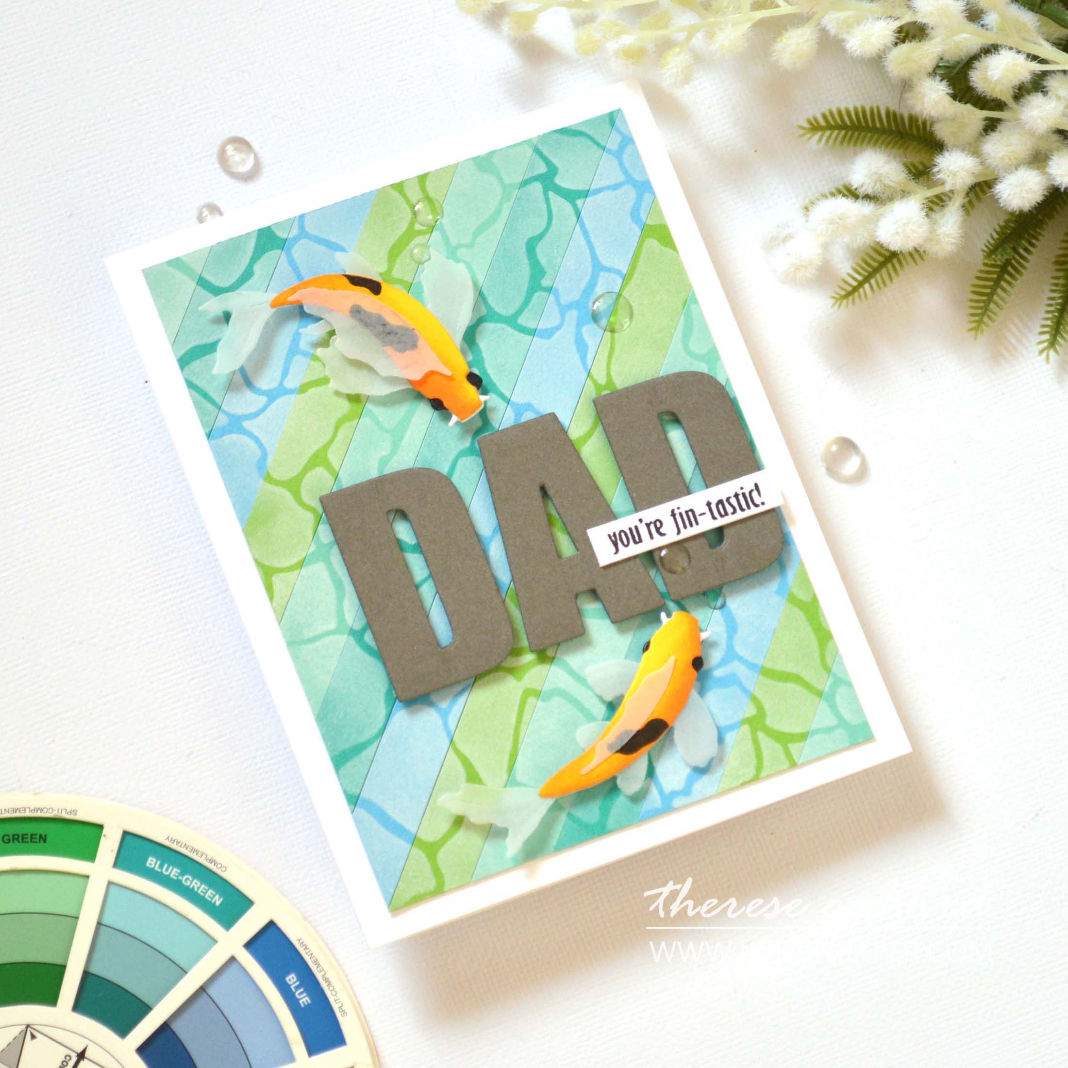
Today I have 5 TIPS to make an EASY Colour Combo!
I love mixing my own colour combos, but I know that this can be a real struggle for many. Today I have a formula that will help you create a beautiful colour combination every time!
TIP #1 – Analogous
Use an Analogous colour combo! This is one of the easiest combination of colours to create. Simply choose anywhere from 2-5 colours that lie beside each other on the colour wheel. It’s as simple as that! I have a colour wheel and refer to it often, but you can also search for a free version on the internet for inspiration.
You can choose any combination of warm or cool colours and today I chose a ‘cool’ combination of three:
Blue | Blue-Green | Green
TIP #2 – How Much Colour?
Choose a minimum of 2 colours and a maximum of 5, but typically 3 is most common. And you can also use these colour combinations in many different proportions.
Both of my card examples today have used an equal amount of each colour, but you can mix it up with the 60%, 30% and 10% rule. Using a dominant colour for 60% of your design, a secondary colour for 30% and a pop of colour for the remaining 10% of your design.

TIP #3 – Mix Shades & Tones
Did you know that you can mix different shades and tones of your chosen colours? For example, I used 2 shades of blue and 2 shades of blue-green in my colour palette today.
TIP #4 – Neutrals
Neutrals are muted shades that appear to be without colour, they are not found on the colour wheel, but will compliment all colours. The four most common are black, white, brown and grey, but the list also includes shades that may have an undertone of colour, such as taupe, beige, tan, ivory and cream.
You can confidently add neutral colours into your analagous palette at any time. Today I added a warm grey for the die cut sentiment.
TIP #5 – Complimentary
If you want to add in anther colour then take a look at your colour wheel. This time, I would recommend looking exactly opposite your chosen colour palette, this will give you the ‘complimentary’ colour that will co-ordinate (not clash) with your design.
For this colour combination today the complimentary colour is: Red Orange (check out the fish).
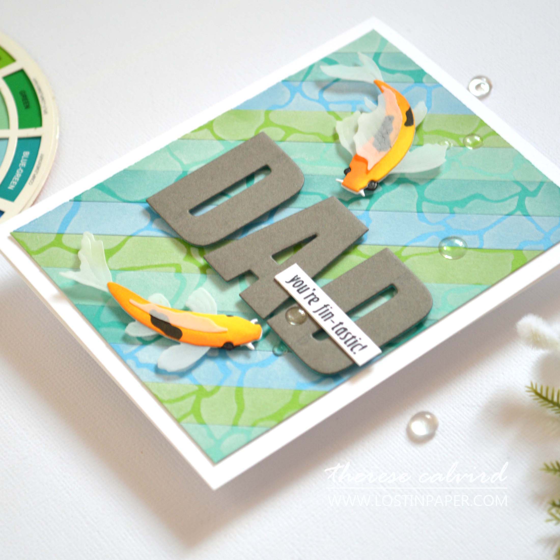
BONUS TIP: Step up your design by adding a fun detail to your coloured background. I added a pattern using a stencil, but you could also stamp over top or add texture using an embossing folder.

I hope you are inspired to create your own colour combo on your next handmade card project! If you do, don’t forget to share them on social media with me, I’d love to see what you make!
Sending crafty hugs your way today,

Also, just in case you want to do a little shopping I’ve added the links below (some of them are affiliate links which means that I will receive a small portion of the sale at no extra cost to you). This is a great way to support me and the shops that I love 🥰!
Other Supplies:
Cardstock: Altenew – Carribean Sky | Lagoon | Volcano Rock | Dark Night | Moon Rock | Fresh Lemon.
Adhesive: Glue Dots – Vellum Dots (no longer available)
 Zero Waste 3D Floral Cover Die ALT | SSS |  Timeless Sentiments Die Set ALT | SSS |  Calming Koi ALT | SSS |  Caps Bold Alphabet Die ALT | SSS |
 Water Builder Stencil ALT | SSS |  Neenah Solar 110 AMZ | SSS | Neenah Solar 80 AMZ | SSS |  Altenew Cardstock ALT |
 Vellum ALT |  Obsidian ALT | SSS |  Cloud White ALT | SSS |  Snapdragon ALT | SSS |
 Mini Blending Brush Set ALT | SSS |  Fine Liner Pen Set ALT | SSS |  Crystal Clear Enamel Dots ALT | SSS |  Tweezers ALT | SSS |
 Fine Blade Scissors ALT | SSS |  Bone Folder Altenew ALT |  Score Board ALT | SSS |  Sticky Grid Mat ALT | SSS |
9″ Fiskars Paper Trimmer AMZ | SSS |  Bigshot SSS | Bearly Art Glue AMZ | SSS |  Glue Tape ALT | SSS |
 Foam Tape ALT | SSS |  Satin Masking Tape ALT | SSS |  Adhesive Sheets ALT | SSS |  Sticky Dots SSS |
Therese! You already know that I do love my grey – but today you’ve proven it to be a color that plays well with its ‘neighbors’ next door, and ‘across the way!’
Two fabulous cards – LOve the fish!
=] M
I especially love the colours next door (wink)!
Oh Therese
Fabulous cards. Love them both but those fish are amazing. Great video!
Hope you had fun camping with your sister and the boys.
I love the way you made your color combinations. I usually make my own color combinations as well. I also absolutely loved the design you used for your cards. Thanks for sharing.
So glad you enjoyed this colour combination, I agree, it’s fun to mix colour combinations!
Two marvelous makes, Therese! Those fish are incredible!
Aren’t these fish wonderful, I like the ‘stamp’version as well, they are a little more flourish’y. Thank you Lisa!