
What if one embossing folder could do more than you think… with a little ink?
This project is part of my new Same But Different Series: Embossing Folders – you can find the playlist here (coming soon) – where I’m sharing stash-friendly ways to get more out of the embossing folders you already have – one idea, one technique, and plenty of helpful tips each time.
So, are you ready to see today’s cards?
Grab a cuppa and watch the video right here, or head over to YouTube to see it in HD.
Also, this post contains affiliate links. If you choose to click and shop, I may receive a small commission at no extra cost to you. It’s a lovely way to support both me and the crafty shops we all love.
Thanks a bunch 🥰!
#EMBOSSINGFOLDERS
Embossing folders are one of those supplies that are easy to use, affordable, and surprisingly versatile. With just a bit of pressure (and sometimes a little ink), they can add instant texture and interest to a card – no fancy tools required.
Inked Embossing Folders
This is a simple technique, but it gives you two very different results depending on how you emboss.
Inked Embossing Folder – How To
- Ink the embossing folder: Lightly tap ink onto the folder. This technique is more organic than precise, so don’t worry about perfect coverage.
- Add your cardstock: Place the cardstock into the folder, choosing whether you want an embossed (raised) or debossed (pressed-in) design.
- Emboss the panel: Run the folder through your die-cut machine. If the details aren’t crisp enough, try adding a thin paper shim to increase the pressure.
- Reveal the texture: Open the folder to reveal a beautifully textured, inked design.
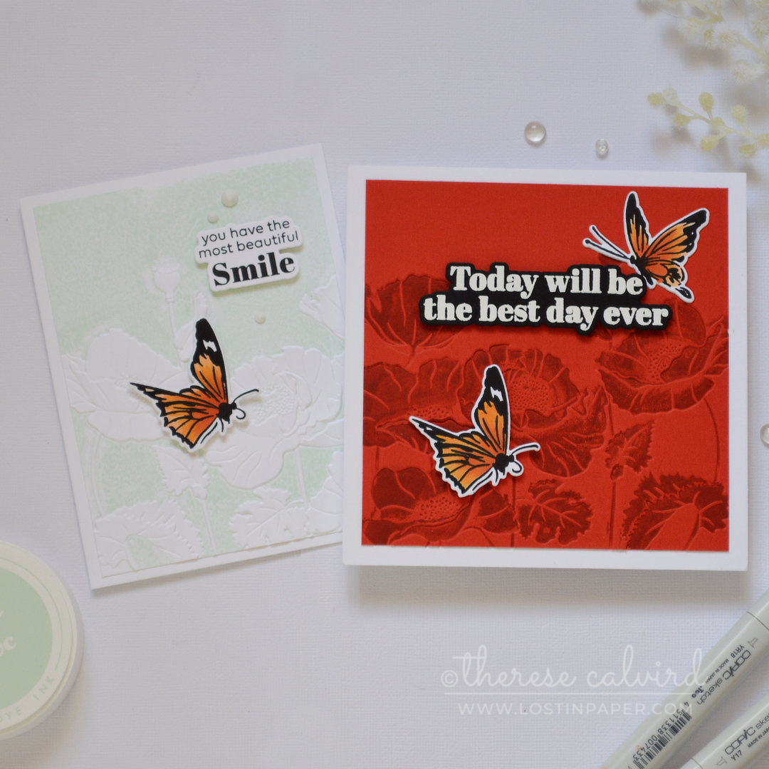
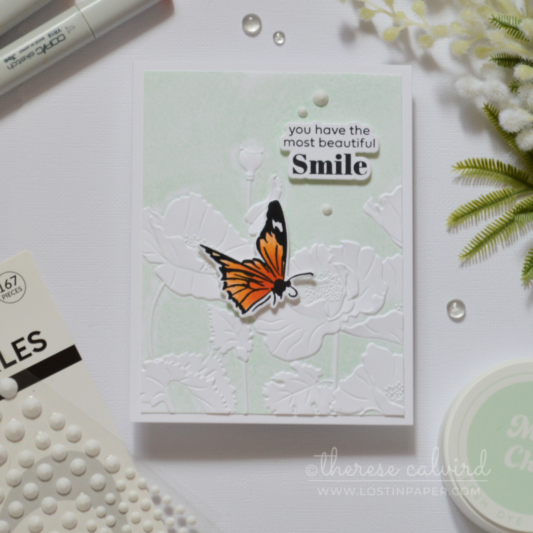
Card #1: Inked Embossed Panel
For the first card, I went with an embossed (raised) design using a soft pale mint ink over a poppy embossing folder. I tend to get better results with lighter inks but you can certainly try whatever you have on hand.
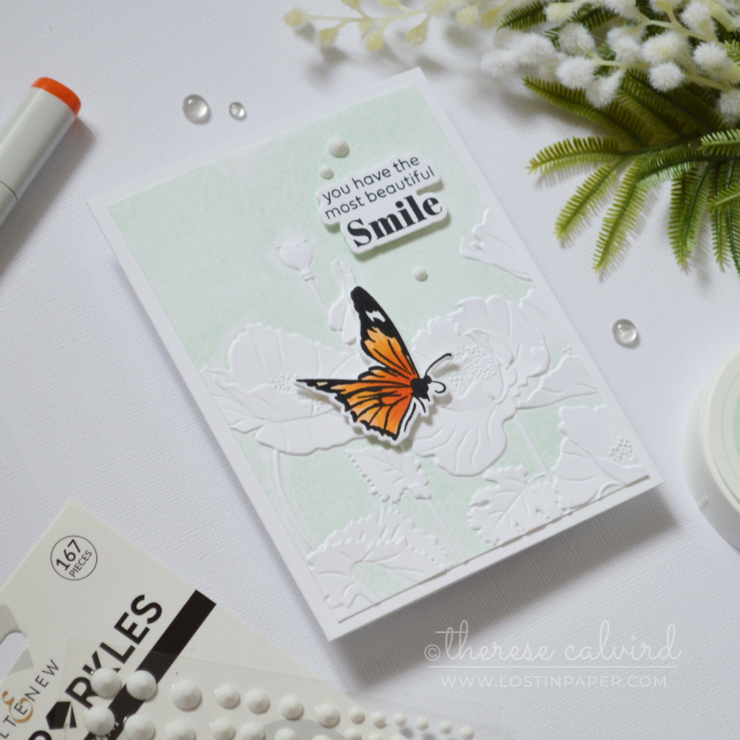
Best of all, you can use either dye or pigment inks for this technique.
PRO TIP: Don’t panic if dye inks look splotchy at first – as they dry, the colour soaks into the paper and often levels out on its own.
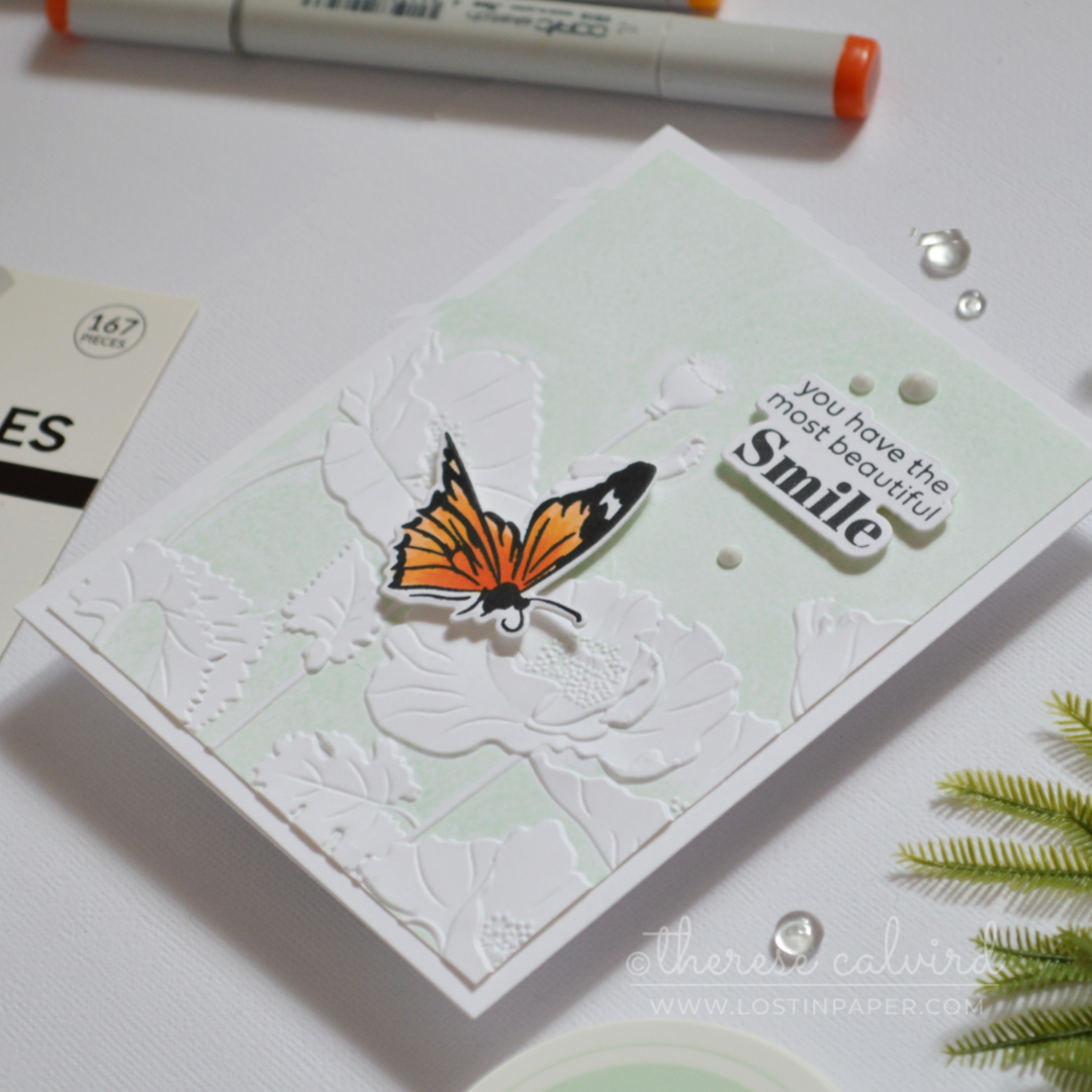
I couldn’t bring myself to trim these panels down too much – the patterns looked too good! A premade sentiment and a few ready-made butterflies were all that was needed to finish them off… thank you so much, past Therese! 😆
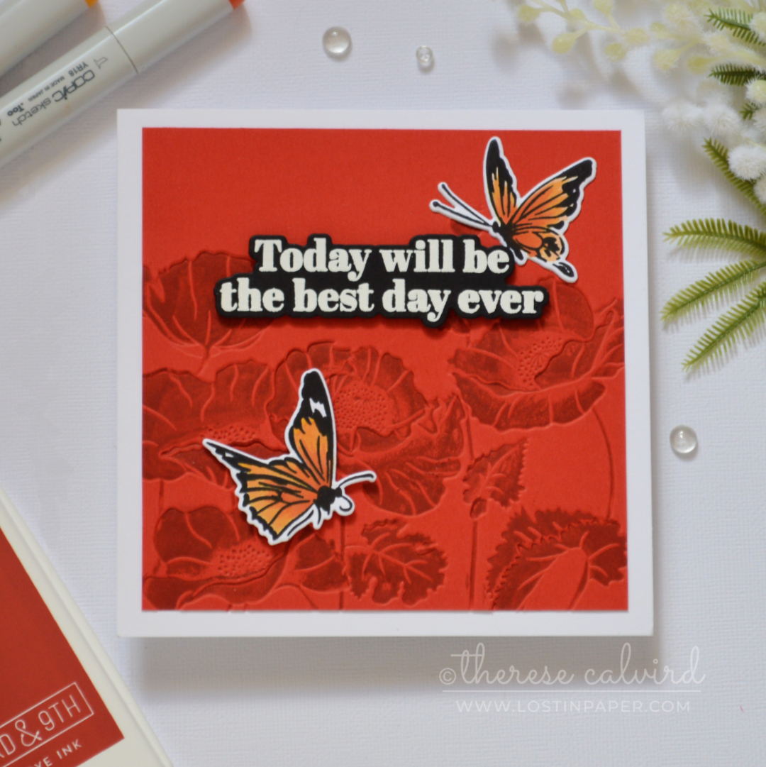
Card #2: Debossed Inked Panel
For the second card, I used the same embossing folder, but this time debossed (pressed-in) the design onto bright red cardstock with a deeper, richer red ink.
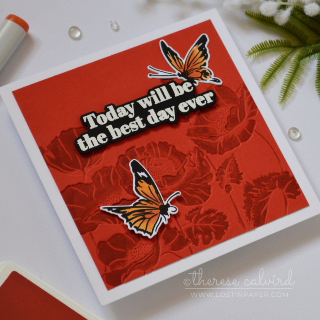
Starting with coloured cardstock instantly stepped this version up and gave it a bold, tone-on-tone look.
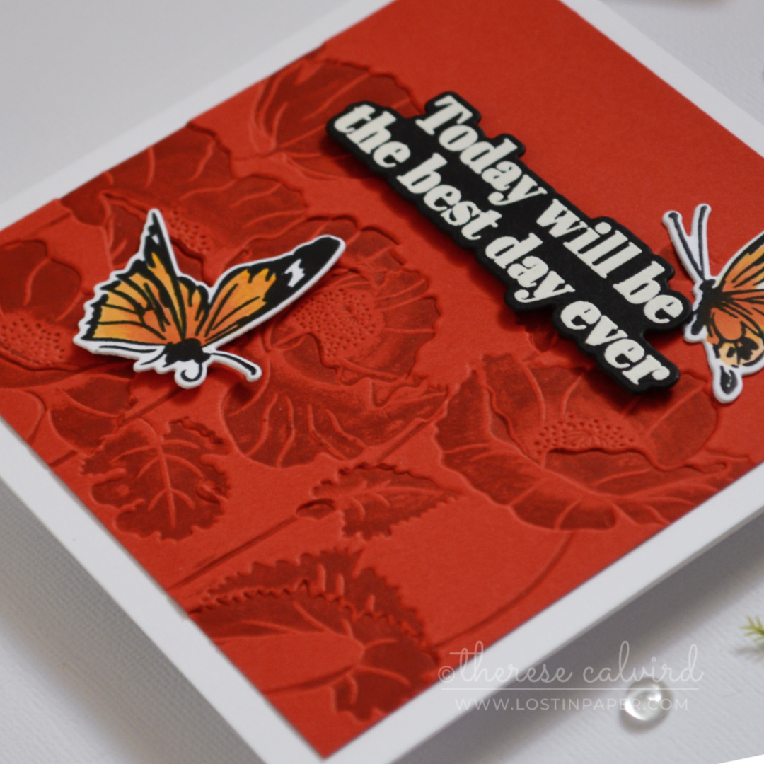
It’s amazing how flipping the embossing folder creates such a different feel – same folder, similar idea, completely different result.
Tips & Ideas to Step It Up
- This technique won’t give perfect coverage every time – it’s meant to have a more organic finish
- If your details look a little soft, a thin paper shim can make a big difference, or realign add more ink and emboss it again if needed.
- Try using multiple ink colours on one folder – work from light to dark to avoid contamination
- Don’t want to go direct to folder with an ink pad… try sponges, daubers, foam pads or even brayers.
- You can also re-emboss the same panel with a different ink colour for another look
- Works with dye or pigment inks, so use what you have
- If you’re using a 2D embossing folder, apply ink very lightly since the details aren’t as deep
Now it’s over to you!
Try this inked embossing folder technique and don’t forget to share your creations with me on social media – I’d love to see what you make.
More embossing folder inspiration is on the way, so stay tuned.
Happy papercrafting,
Special thanks to my crafty assistant, Chad (aka ChatGPT), for helping me stay on track with my Gemini brain, grammar, and spelling… well, all the things! 😄
Embossing Folder: Altenew – Peaceful Poppies 3D (retired)
Ink: Concord & 9th – Sea Glass | Brichyard | Altenew – Mint Choc.
Cardstock: Concord & 9th – Poppy | Altenew – Jet Black
*Certain content that appears on this site comes from Amazon, this content is provided ‘as is’ and is subject to change or removal at any time. As an Amazon Associate I earn from qualifying purchases.
 Billowing Peonies ALT | SSS |  Meadow Reflections ALT |  Neenah Solar 110 AMZ | SSS | Neenah Solar 80 AMZ | SSS |
 Concord & 9th – Cardstock OTH |  Altenew Cardstock ALT | SSS |  Tuxedo Black SSS |  Nocturne SSS |
 Versamark Ink SSS | OTH |  Concord & 9th Ink SSS | OTH |  Aqua Island ALT | SSS |  Copic Markers SSS |
 Gem Sparkles: Milky Way ALT |  Pure White ALT |  Powder Tool SSS |  WOW Heat Tool SSS |
 Perfect Picker ALT | SSS |  Tweezers ALT | SSS |  Fine Blade Scissors ALT | SSS |  Bone Folder ALT |
 Score Board ALT | SSS |  Platinum 6 ALT | SSS | SB UK | SB US |  Platesaver OTH | 9″ Fiskars Paper Trimmer AMZ |
 Glue Tape ALT | SSS |  Foam Tape NEW sizes! ALT | SSS |  Satin Masking Tape ALT |
Oh l love this technique for stretching supplies. Must try this again. The mint background is just so soft and pretty!
Thank you Vicki, hope you get a chance to give it a go!
Both of your examples are very pretty. The soft green and the bold red. I need to try this technique!
Hope you have fun with it Karen!