
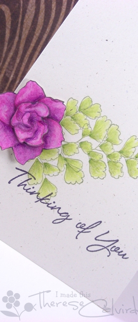
I can’t believe that I am already back with another post for Muse! Lately I seem to be stamping with anything but black, even when I’m colouring in. I love the subtle look of the green stamped leaves when they are then coloured in green, I’m not sure why I would even think to stamp the flower in brown and colour it purple, originally I think it was going to be pink, but it seemed to turn out okay anyway…. I’m being as clear as mud, but I’m sure you ‘get my drift’ lol.
I can’t wait to see how this card inspires you!


All of the deets can be found here on the Muse blog…. but here’s how it works:
- Use ANYTHING you want from your stash to create a project inspired by this week’s Muse.
- In your post, explain how you were inspired and link back to the Muse blog.
- Provide supportive comments on at least 3 other member’s submissions.
- Vote for three of your fellow member’s submissions.

Other Supplies: Stamps – Growing Green (Stampin’ Up) – Thank you Donna! Recycled cardstock. Inktense Pencils – Fuchsia, Dark Purple, Thistle. Prismacolor Pencils – White, Limepeel, Yellow Chartreuse, Olive Green.
 |  |  |
 |  |  |
 | ||
 | |  |
|  |  |

Gorgeous card, Therese! I had fun casing it for my post this morning!
Amazing flower – the colouring is so lifelike 🙂
So gentle and very pretty Therese! The coloring is really dimensional and very beautiful.
You have really achieved so much depth of color on your flower! Thanks so much for inspiring me with your beautiful card!
This card is SO beautiful!! Love your coloring, the flower looks three dimensional.
That flower just jumps out Therese.
Gorgeous card, love it xx
Beautiful design, I do love the soft coloured lines when stamping in grey or brown too….. it lets the colouring shine more :0)
Jenny x
Wow Therese! A beautiful card!
wow gorgeous..that flower really pops.. love it
Absolutely stunning, Therese! Those colours are meant for each other, and somehow the outline in brown just makes the flower pop even more. Now to remember to try to do that on purpose!
Gorgeous colors! They really shine against such a neutral background. And I love the outline stamping in colors. I very rarely use black. Even when I need a darker color to stamp an outline, Versafine in sepia is my go to for a more natural look.
Wonderful colours, Therese, love how the bloom is just peeking over the edge … thanks so much for the inspiration! Anita 🙂
Stunning Therese. Beautifully coloured Cathy x
Beautiful!! Love what you did with those Prismas!! I can’t wait to use mine again!!
[…] I’ve got a lot of birthday cards to make.  Here is one that I’d like to share.  I love this card by Therese Calvird.  This card was the inspiration for the 12th Challenge in the Muse […]