
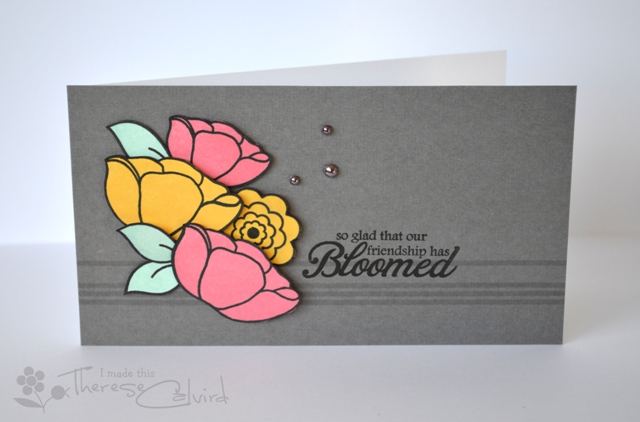
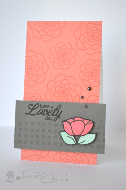
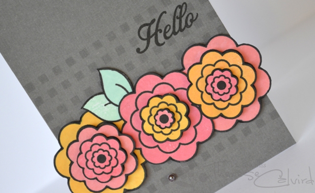
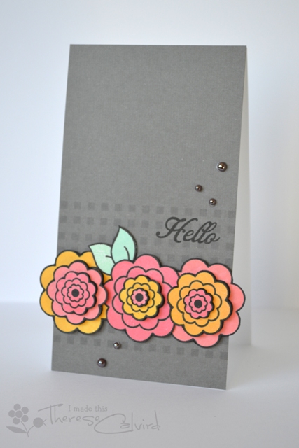
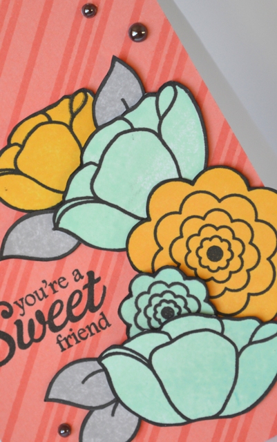
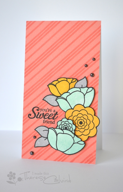
I’m catching up on my publication shares and this was a set of cards that I put together for the Australian Cardmaking, Stamping & Papercraft magazine. Loving that warm grey…. and these HA inks stamped so beautifully, sigh!


I’m back tomorrow with another ‘very different for me’ card for MUSE , so I look forward to seeing you then.

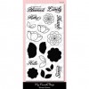
Other Supplies: Cardstock – SBB Shadow, Peach.
 |  |  |
 |  |  |
 |  |  |
 |  |  |
|  | |
|  |  |
|  |  |
 |
As I scrolled down to look at each card I found myself saying…oh, oh, oh..wow! I love these cards Therese! Loving the soft gray with those yellows and pinks. Stunning.
Oh my goodness Therese these are soooooo beautiful. You are so inspiring girl! I want to buy everything listed and make all these for myself . Love love love!
These colours are just beautiful, stunning designs Therese x
What beautiful cards. I have this stamp set and am thinking I need to get it out. Thanks for the inspiration.
What a great set of cards. Thanks for sharing.
wow love how the colors pop right off the gray background.. awesome cards..
Beautiful colors and gorgeous designs, Therese! I’ll bet this is a really pretty card set IRL! Congrats on another publication!
Awesome set of cards! I love the colours you used!!
Gorgeous! Love the colour combo and how you have created so many different cards, yet used the same colour palette and stamp set. Clever!
These are all gorgeous Therese. I love that grey.
Fabulous each and every one!
What a fabulous set, Therese – the stamping is so smooth, and the gray card stock is gorgeous! Whoo Hooo – another publication – so not surprised!
The tone on tone stamping is such a gorgeous backdrop for all those beautiful blooms, Therese … congratulations on having them published! Anita 🙂
What wonderful cards…love the tall skinny size and colour combos too…. the first is my fave :0)
Fabulous designs and colors 🙂 You r soooooooooo talented !
I’m with you there, I just love grey with soft pastel colours. These are all so beautiful and those flower stamps/dies are gorgeous (another one for my wishlist!). You’ve been published quite a few times now, do you still get excited when you see your designs in the magazines?? I was flicking thru some older ones the other day and saw one of your cards, was so awesome to put a face to the name!
Oh, this colours combo is AWESOME – the grey makes everything pop!