
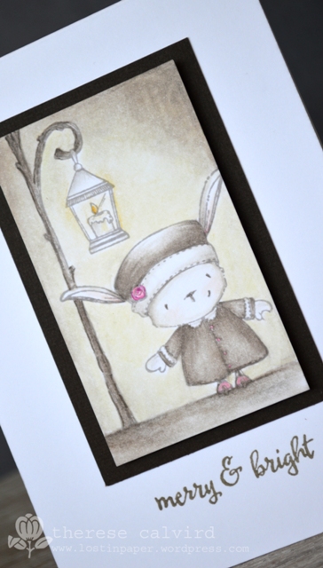
I’m still playing with A Charming Winter, the fabulous new release from Purple Onion Designs and Stacey Yacula. I decided to make my card ‘merry & (not so) bright’, I thought the little hot pink flower could be the ‘bright’ on it’s own.
You can see my video here or Watch it at Youtube.
[youtube https://www.youtube.com/watch?v=eew_bBkB2so]

I’ve linked all the stamps I used below or head on over and catch the rest of the release at Purple Onion Designs! Have a great day,

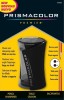
Other Supplies: Prismacolor Pencils – Cream, Yellow Ochre, Light Peach, French Grey 20,50,70%, Ginger Root, Warm Grey 20%, Cool Grey 70%, Process Red, Pink, Sepia. Tack n Peel.
 | |  | |
 | |  | |
 |  |  |  |
 |  | |
So cute! You did a fabulous job with the coloring!
First of all I LOVE that music – it has me bopping along. Secondly your colouring is fab. I wonder if I could do that. I did not like copics so I wonder if I would like Prisma Pencils. Any advice for a novice would be greatly appreciated:) You make it look so easy all that blending, but is it really?? A fab card – love the monochromatic feel. xx
Honestly Linda, these are the absolute easiest of mediums to use! I adore my Prismas and lately they have definitely become my ‘go to’ for colouring. I also have some Faber Castel Polychromos that you can compare (although similar these are oil based), and I have my left eye on the Spectrum Noirs… just pondering if I really ‘need’ them though lol. You are more than welcome to come round and try them out if you want, I’ll put the kettle on!
This is so lovely, Therese! I just love the sepia theme! I should try this idea sometime!
Such fun images and another wonderful card Therese!
Thank you so much for your awesome videos and posts. I learn from you in each one. I am loving using prismacolors and gamsol and thanks to you, I feel like I have some idea of what I am doing! 🙂
This is such and adorable card! Love your coloring, no matter the medium. This release is so fun – just love all these little creatures!
I love watching you color with pencils! Especially to that music-lol I love the colors you’ve chosen, it’s so lovely:) Thank you for sharing your talent with us. It’s very inspiring! I bought my Prismas because of you lol!!!
Your coloring is amazing! I bought myself Prisma color pencils and I have to say that I love them too, but now I think I need some more colors. I have spectrum noir markers as well, and I don’t feel that I can blend them that well when I’m coloring, so now I have been thinking about Copics … But I really don’t know if they are better to color with?
Thanks for always some amazing videos 🙂
So glad to hear that you are a lover of Prisma’s as well, I have the 72 colour tin and love it. But the best thing about these pencils is that you can actually mix the colours to create your own so you could definitely get away with less. Copics are another fave of mine, but do take a little more practice, but still very easy to use and blend. They are expensive and a way to keep the costs down for me was to buy one set of yellows, orange, red etc although when it came to browns because of skin tones, hair etc. I ‘needed’ some more. And I really don’t add to the colours anymore, I make do with what I have and just buy refills when I need to. It’s great that they last kinda forever as you can top them up and replace the nibs etc. I’ve not tried the Spectrum markers but there are some amazing crafters out there that really make them shine. thanks so much for your lovely comments, Hugs Therese
I don’t think this little cutie could be any more adorable, Therese … the wee pink posy is simply perfect! Anita 🙂
Another fab card. Thanks.
Your coloring is gorgeous , Therese! This is a beautiful vintage card.
A masterpiece!!! absolutely love the sepia tones… very atmospheric and cosy xx
Oh I so love this one, u have create a perfect vintage feel to the card 🙂
Wow Therese! This is a mini masterpiece! Love everything about it.
Simply adorable! Your Prisma coloring is always perfect and you make it look so easy. Thank you for sharing your lovely creations.
So sweet! I love how you colored the scene with your Prima pencils!! Adorable!
Love the sepia, vintage photo feel of this with the little pops of pink. Your shading around the lamp light is especially gorgeous.
Oh my dorable! I really love the pops of pink, goes with the sentiment so perfectly!