The same stamps…. the same colouring medium…. the same colours too! But why do they look different?
Welcome back to another Take 2 With Therese, this is my video series for Altenew and if you missed any of my previous videos you can check them out right HERE.
I was playing with the Wild & Free Stamp Set from Altenew today and thought it was about time I did some more Artist Marker colouring. These are alcohol markers that ‘co-ordinate’ with the beautiful Altenew inks. Can you spot the difference in these bouquets? Yes, it’s Line V’s No-Line lol!

This first one has the outline stamped with the Permanent Black Ink before colouring.

I added some Jet Black Ink splatters in the background.

And a sentiment from the Watercolor Dots Stamp Set.

This second version has the ‘No-Line’ look and was stamped with some Morning Frost Ink.

I kept the colours the same as well as a similar bouquet style.

But this sentiment came from the Apothecary Labels Stamp Set.

You can see my video here or Watch it in HD at YouTube.
[youtube https://www.youtube.com/watch?v=Wgm1eHk5FbY&w=570&h=321]I hope you have been inspired to get out your alcohol markers and try some flowers with or ‘without’ the lines. It can really give a different completed look and so stretch your supplies just that little bit more. Thanks for your visit here today, Big Hugs,

Other Supplies: Artist Markers – 0 / R702 / R823 / C001 / Y205 / Y612 / R400 / R206 / R304 / R217 / TG02 / B802 / B714 / G702 / G804 / G915.
Affiliate links are used Classic Crest Solar White 110lb ALT |
 Classic Crest Solar White 80lb ALT |
 Wild & Free Bundle ALT | SSS |
 Wild & Free ALT | SSS | AUZ | EH |
 Wild & Free Die ALT | SSS | AUZ | EH |
 Apothecary Labels ALT | SSS | AUZ | EH |
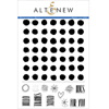 Watercolor Dots ALT | SSS |
 Permanent Black ALT | SSS | EH |
 Obsidian ALT | SSS | AUZ | EH |
 Morning Frost ALT | SSS | EH |
 Warm Gray ALT | AUZ | EH |
 Artist Markers – Set A ALT | SSS | AUZ |
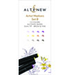 Artist Markers – Set B ALT | SSS | AUZ |
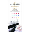 Artist Markers – Set C ALT | SSS | AUZ |
 Artist Marker Set D ALT | SSS | AUZ |
 Artist Markers – Set E ALT | SSS | AUZ |
 Jet Black Spray ALT | SSS |
 Cutting Mat ALT | SSS | AUZ |
 Spring Scissors SSS | AUZ | EH |
 Scissors SSS | AUZ | EH |
 Mini Blossom ALT | SSS | AUZ |
 Gemini Junior SSS | AUZ | EH |
 Bone Folder EH |
 Mini Score Board SSS | AUZ | EH |
 Grid Transparency SSS |
 MISTI ALT | SSS | AUZ | EH |
 Mini MISTI ALT | SSS | EH |
 Acrylic Blocks ALT |
 Glue Tape ALT | SSS | AUZ |

Both are beautiful. I personally like the no line.
Thank you! Using a pale stamp and coloring is something I’ve never seen explained before. Thank you so much for the step-by-step tutorial! I learned so much.
I love them both Therese, but if I had to choose, I’d choose the line colouring. It’d be interesting to know what the majority think. I really do love this clean style with the lovely brightly coloured flowers. It’s just so fresh. Thank you once again for sharing your beautiful work.
Such pretty cards! I think I like the no line better. It makes the flowers dainty and more real. Oh, I tried slowing it down just to hear your voice in a slower speed. I know you said to mute it but I was so curious. I had a real good laugh!! So thank you for that. We all need to laugh during this crazy time.
Absolutely lovely cards Therese! I like your soothing voice & little giggles here & there. Had to giggle when you said the video can be slowed down, but you may want to press mute. ha,ha. Like the old 45’s & 78′ you’d play on different speed. Talk about dating myself. Well, why not. I become a senior citizen in Aug. How did I get here already? lol I much prefer the landscape version of your bouquet as I like the layout & the way you shaded your colours better.
A great tutorial Therese – I always learn something new – this time it was how to tackle ‘no line’ colouring! I had no idea how to approach that style, and you have been so helpful! Two beautiful results – thank you!
Ah how lovely! Such gorgeous flowers. I didn’t realise until I read and scrolled down they were individual stamps! of course you had the patience to colour each flower beautifully and cut individual flowers – I’d be tempted to go for an already assembled bouquet!! 🙂 What a difference between black and “no line” colouring. Really need to get my inky back, I’ve been busy with cutting fabric & knitting! Too many stashes to work on haha.
so pretty – you are so talented!
These are stunning, Therese … I love how the vibrant colour pops on each one! Choosing a favourite … hmmm, think I’ll pass on that … the differences are what make them so appealing in different ways, so I choose both (call me Mme Gourmande!)! Hugs, Anita 🙂
I like them both for different reasons. I tend to stamp and color but no line is tempting. I’ve tried it in the past but maybe started with too detailed an image. Great tip to use lightest color to accentuate the “lines” for no line. That was the most difficult part. Thanks for sharing your talent and giggle with us.
I like both versions very much, and always learn from watching your videos! At first I thought I preferred the line version, but ended up liked the no-line equally well.
I didn’t notice the lines were missing.
I did see that the card with the lines
had more shading and was lighter
than the no-line. Both are
wonderful. thanks for sharing
txmlhl(at)yahoo(dot)com
Oh Therese, it was so refreshing to watch a video from you today! It’s been so long since I’ve been able to do that and I think I was going through withdrawal – lol! Beautiful bouquets, both of them! It was fun to see the difference with and without the lines.
Hello Therese: The no-line was best for me in the final versions. However, when watching the line version, I found that I kept saying (silently) make the line darker and give more definition. But I was completely for the line version until I saw them in comparison at the end!! Thank you so much, Denise
The colouring of the no-line version with the extra depth is my favourite. Amazing result- worth the extra time spent.
They are both amazingly beautiful.
I think both cards are equally beautiful. I love both of them!