Do you want some monochromatic inspiration? Today, instead of seeing in black & white… you may want to enjoy some of my favourite blues!
Would you like to see today’s cards?

But first a quick note, I wanted to let you know that this post contains affiliate links (which means that if you choose to click on my links and buy something nice then I receive a small commission at no extra cost to you – this is a great way to support me and the shops that we love 🥰).
#MONOCHROMATIC
DEFINITION: Monochromatic means a color scheme that is based on a single color, or hue. The other colors within the color scheme are all light and dark variations of that hue. But, how can we use this in card designs 🤔?
Idea #1 – Blended Flowers
I know that IRL (in real life) flowers are not ALL blue, but, I think that this steel grey blue works a treat for both these flowers and leaves in this monochromatic palette. And, with the coordinating stencils, the colouring seemed very fast and easy.
I would suggest using a monochromatic scheme that supports the style of image that you are colouring. although, I think that these flowers would also look fantastic in some pale and bright oranges… I may have to try this! Don’t be afraid to step out of your comfort zone.

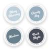
Can you tell just how EXCITED I am that the Tranquility inks have been released in the new Fresh Dye Ink formula… sigh… these ARE my favourite blues from Altenew (but, please don’t don’t tell Dew Drops)!

You may notice that I did not use the ‘layering’ stencil within the set. Instead, I used multiple inks on each petal and leaf to give the image a sense of depth. But, if you prefer, you could easily add the darker blues using the layering stencil.
PRO TIP: Don’t have stencils? Why not colour your monochromatic image using alcohol markers, pencils or even watercolours!

Idea #2 – Blended Background
And, why not make it ombre, you know you want to! This cardstock blends so beautifully with these inks that I just had to try an ALL blue card. I even used the darkest blue to stamp the image, which gave me a wonderful tone on tone effect. A subtle monochromatic bouquet where the sentiment steals the show, until you look at what’s beneath.

Did you know that you can add a neutral, to monochromatic palette, at any time? These are variations of black, white, greys, browns, beige etc. BUT, if you are feeling in a true monochromatic mood, then you can stamp the sentiment in one of your chosen hues instead!

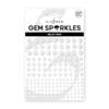
A bit of a fan, gotta say… these NEW additions to the Gem Sparkles family make my heart happy!

Are you ready to create in MONCHROME? I’d love to see what you are making and what inspires you!
Crafty Hugs,

Other Supplies:
*Certain content that appears on this site comes from Amazon, this content is provided ‘as is’ and is subject to change or removal at any time.
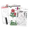
 Dreamy Dahlias ALT |  Elegant Sayings ALT | SSS |  Lovely Flowers ALT |  Ornate Nesting Die ALT | SSS |
 Neat & Nifty Storage Pockets (large) ALT |  Neenah Solar 80 AMZ | SSS |  Neenah Solar 110 AMZ | SSS |  Porcelain Cotton Card Panels 118lb SSS | SB |
 Obsidian ALT | SSS |  Tranquility ALT |  Ink Blending Tool ALT | SSS |  Mini Blending Brush Set ALT | SSS |
 Pure White Spray ALT |  Gem Sparkles: Milky Way ALT |  Crystal Clear Enamel Dots ALT | SSS |  Tweezers ALT | SSS |
 Bone Folder Altenew ALT |  Stampwheel 2.0 ALT |  Chuckie (pressure) Tool OTH |  Platinum 6 ALT | SSS |
 9″ Fiskars Paper Trimmer AMZ | SSS |  Bearly Art Glue AMZ | SSS |  Glue Tape ALT | SSS |  Foam Tape ALT | SSS |
 Satin Masking Tape ALT |

Okay, Therese. You [most of all] know how I feel toward blue… BUT I have to say it – that first card has had a serious impact on changing my mind! GORGEOUS in every way!
Two very beautiful cards, my friend!
=] M
Now… maybe if I made it in grey, would that make you happy lol.
Monochromatic is so soothing . . . no decisions, just one color. And with that blue it’s amazing.
I was so happy when Altenew announced the Tranquility set in the Fresh Dye Inks, it’s one of my faves!
Oh these are just beautiful, Therese! I especially love the first card with blue flowers and leaves. I’ve made some blue leaves, but never thought to have the flowers match like this. Definitely want to case this!
How wonderful Greta, hope you have fun creating!
I love the look of monochromatic so I don’t know why I haven’t made cards using that technique much, especially with my favorite color scheme of any blue hue. Very soft and pretty!
It’s not one of my usual ‘go-to’ styles either, but it’s always such fun to do!
Two great ways of using monochrome with the beautiful cards you made. I especially love the blue and white blended flowers!
So happy you liked these Verna!
The blues are so very pretty. And calming. GREAT job.
So glad you like them Sharon!
Both are beautifully done, Therese!
Thanks so much!
I LOVE your monochrome designs and flowers! STUNNING!
Thank you Meghan!
The earlier commenter who said how soothing monochromatic is articulated beautifully what I was thinking…. it’s really lovely not having to worry about color combos, coordinating, etc. The whole card already “works” without so much work LOL. GREAT JOB on both cards.
Lori S in PA
I agree Lori, it really takes a lot of the ‘thinking’ away lol. Glad you like them!
Outstanding cards! Wish there was a video, but I will try to CASE!
I can add it to my ‘to-do’ list for you Sarah!
Such beautiful cards! Love the colors, blue is my favorite. Thanks for sharing.
Yay! So glad you like them Jeanne!
love these cards – awesome color choice
Thank you Dee!
Beautiful cards, Therese!
Thank you Mari!
I love these cards! The flowers on the sympathy card are beautiful!
They are such a pretty bouquet, I agree Lauryne!
Both cards are beautiful and elegant. The second card is my favorite though!
Thank you Nandini!
OMGoodness these are magnificent! LOVE the blues! Lovely designs as well!
Thank you Donna!
My goodness, these are stunning!!!
Thank you so much Lisa!
It’s always a pleasure to visit your blog, Therese! Or watch your YouTube videos! So much lovely inspiration! I’m going to be a guest designer for Altenew in February (HAPPY DANCE!! Such a blessing to try out some great new Altenew products!), and I definitely want CASE your cards! I have that Ornate Nesting die set and love how you used it here! Thanks for putting out such beautiful content!
Yes, it’s a fabulous nesting die shape and I love flipping it both ways!
I love the look of monochromatic cards so easy to do and so relaxing to the eyes Your colors e so pretty. I love the new release and the colors. tyfs 🙂
Thank you Linda, I agree, this set of colours makes me calm!
These are lovely. I love the tranquility colours.
Me toooooo!!!!!
Love your cards! And I do love that set of blue inks. Blue is my favorite color.
It’s one of my faves too!
Lovely! Wonderful colors! I love the blues. Happy Holidays!
Thank you Jade!
These cards are gorgeous, I’ll definitely have to give blue florals a try!
So glad you liked them!
Both cards are very pretty.
Thanks so very much!
These cards are so pretty. My favorite is the one with the Dahlias, the new ink colors are perfect! TFS therese!
Thank you so much Liz!
What pretty cards! I like your monochromatic techniques, which would of course look great in any color!
I agree, it’s such fun to play with colour, and it can certainly change the look of something!
Beautiful job! Love the monochromatic coloration! Beautiful ink color!
Thank you so much Shannon!
I love the placement for the images and the idea for the layers. The color set is a beautiful one.
So glad you like these Ms. Tamp!
Lovely floral designs and colors!
Thank you Denise!
The blues bring a calmness to your cards. I generally tend to use multiple colors, but I definitely like this style.
Yes, I am usually a ‘multi’ colour girl myself too!
The blended flowers card is stunning! But both cards look elegant and refined!
So happy that you like these!
I am actually kind of surprised to hear that the cotton- betterpress paper is good for blending. I would have guessed it would be textured. I will have to try it out.
It’s almost like blending on watercolour cardstock, which works beautifully too!
Pretty! Monochromatic seems to be the theme for December projects. I need to try it sometime.
Hope you have fun trying this technique!
Gorgeous cards! I am inspired to try monochrome, such a lovely technique.
Hope you have fun creating Laurie!
The tranquility ink set is an all-time favorite of mine! And monochromatic cards are always extra lovely!
Thank you Janea, I love the look of monochromatic too!
Gorgeous – love the colors!!
Thanks so much!
Can’t decide which one U lie better…both very nice
Thank you so much Bonnie!
I love the monochromatic flowers in the blues! Unique and so wonderful! JLM
Thank you so much!
I love the monochromatic look on first card. Simply stunning in the blues.
I am going to have to create some more monochromatic designs, this was such fun!
Beautiful card â¤ï¸. Thank you for the inspiration.
Yay! Thank you Orit!
The coloring and mutes tones of your sympathy card are gorgeous!
So glad you liked it!
Your colour choice is amazing, super duper stylish, clean and outstanding. Sympathy cards are not the easy cards to make, but you have made such delicate design here. Hugs xx
So glad you like it Angellica!