
Did you know that the Blackout Technique can be done with pastel colours? It’s TRUE!
This post contains affiliate links (which means that I will receive a small portion of the sale at no extra cost to you). I truly appreciate your support of these card adventures!
Don’t know what the Blackout Technique is? I explain it in my post HERE along with card examples, tips and tricks. And, if you want to see this fabulous technique in action, I have a LIVE VIDEO where I tried out a few different ways to create panels and you can watch it Right HERE!
#BLACK&PASTEL
Previous cards that I have made using this technique were bright and bold, so that made me wonder… what would this technique look like if I used softer, more subtle colours? So, I thought I could give it a try and here is the result…
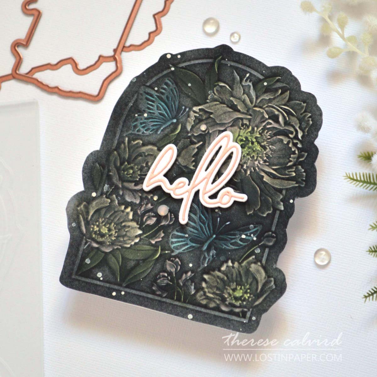
I used the beautiful Floral for You 3D folder and ink blended directly onto the debossed flowers, butterflies and leaves. Next, I used a flat sponge blending tool to add black ink, although I tried not to go too heavy handed as I had used the pastel colours and still wanted them to be seen.
PRO TIP: For a fabulous debossed result spritz some water onto a piece of BetterPress cardstock before running it through your die cutting machine (thank you for this wonderful tip Yana!).
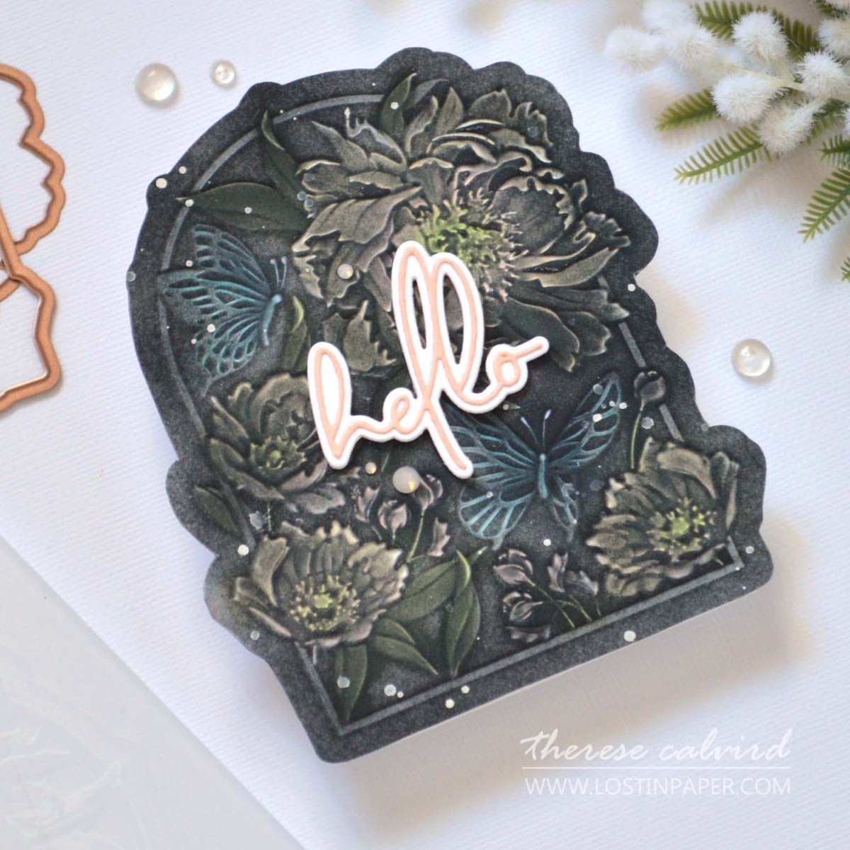
I took it a step further and added a little Splatter White ink as well as some crystal gems. This folder has a coordinating die but today I decided to fussy cut the border of the image to create a shaped card instead.

I hope you are inspired to create a pastel version of the Blackout Technique and it you do, don’t forget to share it with me on Social Media. I’d love to see what you make! Crafty Hugs,

Other Supplies: Spellbinders: NEW RELEASE 3D & Emboss Cut Folder – Floral For You (E3D-082)
Inks: Firefly | Frosty Pink | Coral Berry | Wisteria
 Neenah Solar 110 SSS |  Neenah Solar 80 SSS |  Porcelain Cotton Card Panels 118lb SSS | SB |  Wonderful Script Sentiments SSS | SB |
 Tuxedo Black SSS |  Buttercream ALT | SSS |  Dew Drops ALT | SSS |  Aloe Vera ALT | SSS |
 Green Valley ALT | SSS |  Red Cosmos ALT | SSS |  Enchanted Garden ALT | SSS |  Micro Blending Brush Set ALT | SSS |
 Mini Blending Brush Set ALT | SSS |  Crystal Mix Gems SSS | SB |  Splatter White SSS | SB |  Watercolor Brushes Round ALT | SSS |
 Faber Castell – Water Cup SSS |  Blending Tool SSS |  Bone Folder Altenew ALT | SSS |  Sticky Grid Mat Ultra ALT | SSS | SB |
 Score Board ALT | SSS |  Paper Trimmer SSS |  Bearly Art Glue SSS |  Foam Tape ALT | SSS |
though i think this technique can be very effective for a card,
many of the cards i have seen do not really take advantage of
the technique itself as the ‘show stopper’ part of the card.
this particular card for example, looks kind of like a ‘spooky’ garden
with some sentiment put on as an after thought in a bright color that
sticks out like a sore thumb instead of an addition of a sentiment
that goes w the design colors of the card.
i know you are thinking that i am being rude, but i’m just trying to
be truthful. techniques are wonderful to use, but design is just as if not
more important than the technique.
if you don’t have the design refined, doesn’t matter what the technique is.
i’ve seen a lot of cards come out lately on dif sites, that have a great
technique idea but the execution of the card is sloppy and rushed.
getting something out there just to get it out there is a mistake.
it does not inspire.
again, not meant to be negative, but to be helpful. i have been in
the art world for over 50 years, have enjoyed card making because it is
immediate gratification of finishing something in one sitting, but
as much care making a card should be taken as when working on
your ‘mater piece’ in another medium.
thank you , sam
Hi Sam, thank you for taking the time to comment and for your thoughtful response.
When I was creating the card I also had the thought of a tombstone and that is why I tried to lighten it up with the sentiment. I do like how the pastel tones look with the grey and this card took me a long time to create, so I promise I was not rushing it. I do hope it doesn’t look like I did.
Thank you for visiting, I hope you have a wonderful and crafty day. Hugs, Therese
It does have a lovely muted effect!
Thanks so much
This card is AMAZING! I absolutely love it!!
You are so sweet, thank you
And just like that, you’ve made me want one more embossing folder! lol Thanks, Therese – it is STUNNING!
=]
It’s a beautiful folder, just sayin
I agree with Michele you are a minx !! I have tried with bright colours but never with pastels I must give it a go the result is fantastic.
Marie
Hope you have fun creating!