
Interactive Fun Fold Christmas Card with a Flip Window | LIVE
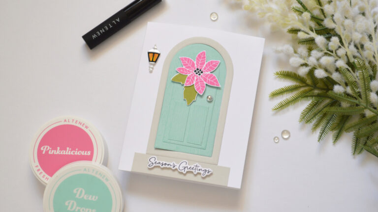
Have you ever seen a card idea that you just HAD to try? 🎄
Have you ever seen a card idea that you just HAD to try? 🎄
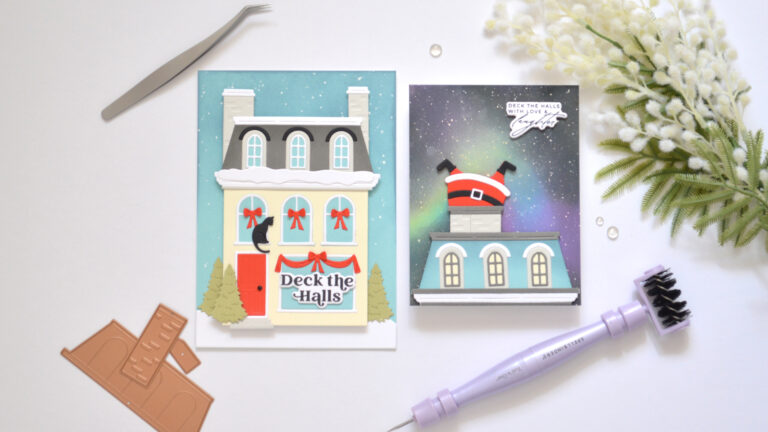
What could be hiding in your dies?
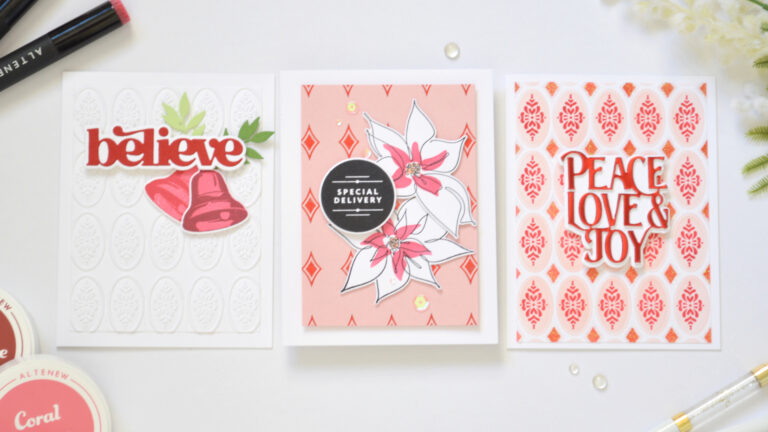
From flat to fabulous? Today we’re adding texture three different ways!
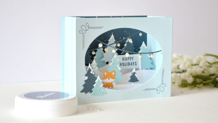
“Are you ready to add some depth? Today we’re building it with fun folds!”
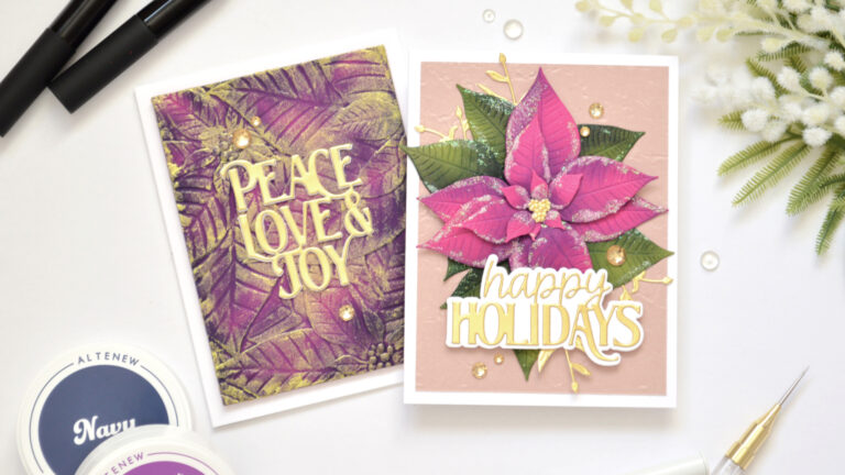
Who says simple cards have to play it safe? Today we’re piling on the poinsettia texture!
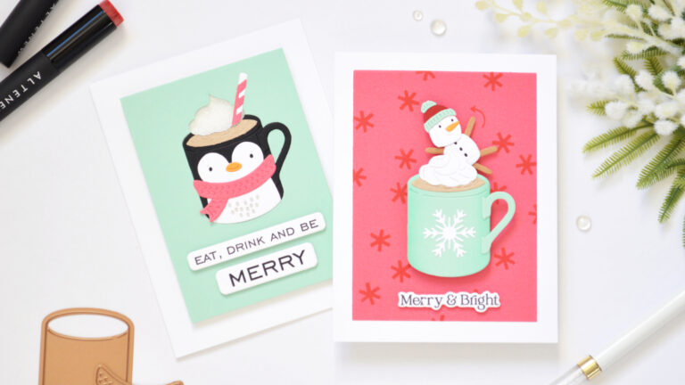
Who says simple cards have to sit still?
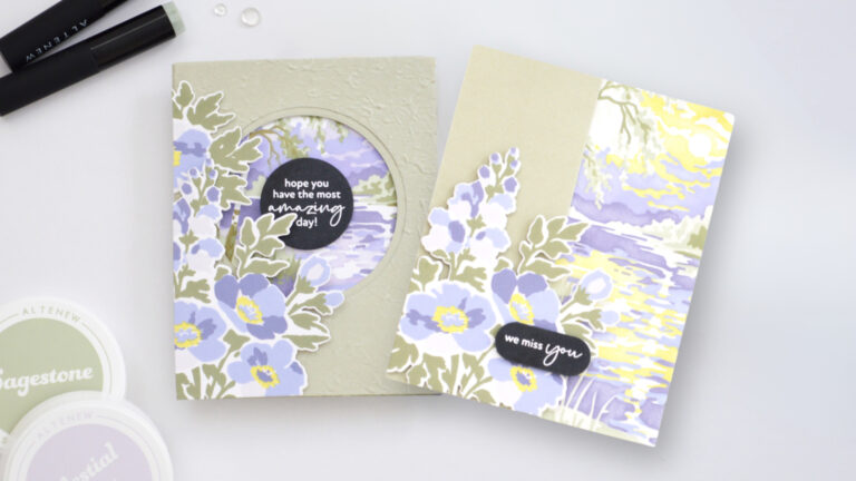
Want to add a little extra interest to your floral cards without making them complicated? A simple fun fold can do just that.
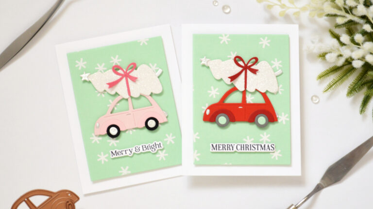
Choosing colors doesn’t have to be complicated…
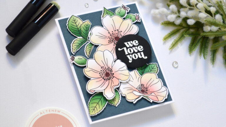
Can a floral card be quick to make and still look striking? Today I’m sharing an easy one-go floral design with soft pastel ink blending – plus a fun surprise about my new interactive card class!
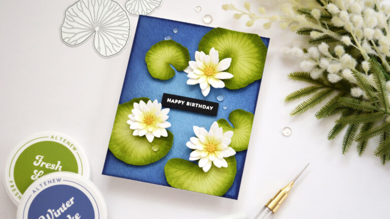
Let’s make a splash with pond lilies and an analogous color scheme!
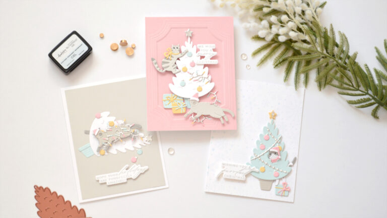
I started with one carefully planned Christmas card color palette…
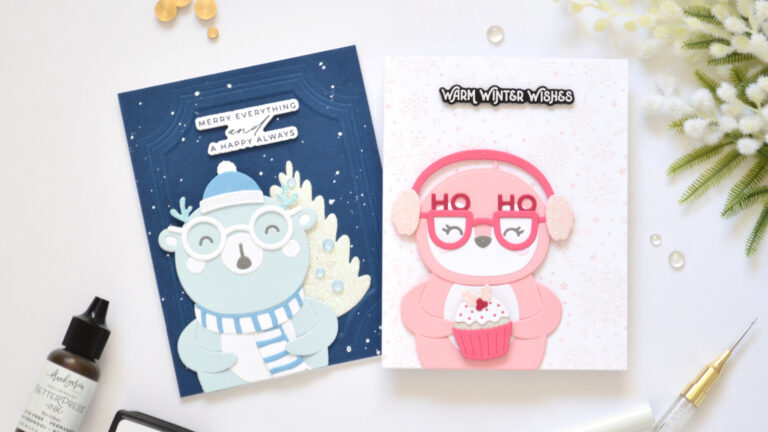
Does anybody remember the movie Pretty in Pink? Because the only thing I don’t remember… is the penguin! 😂
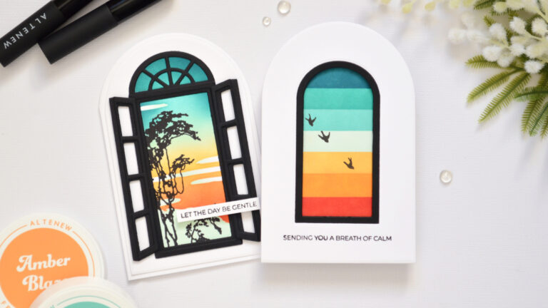
Shaped cards are such a fun way to make a simple card feel anything but ordinary!
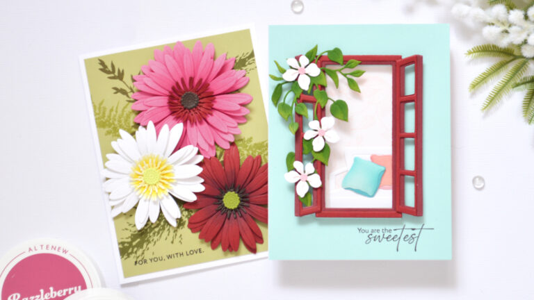
Did you know a window frame could become a seat?
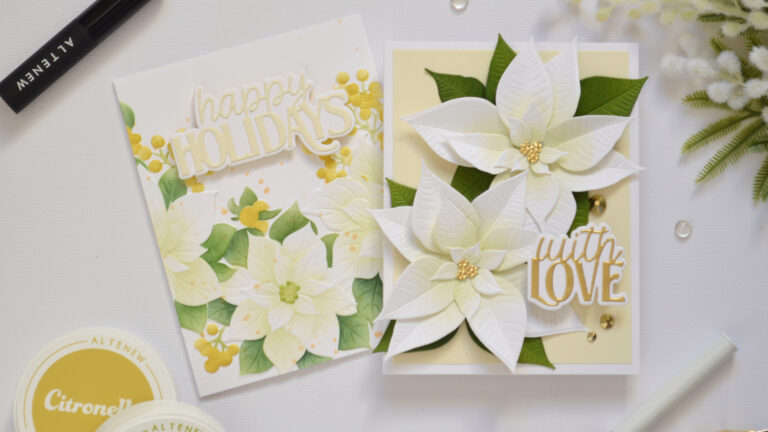
Who says poinsettias have to be red?
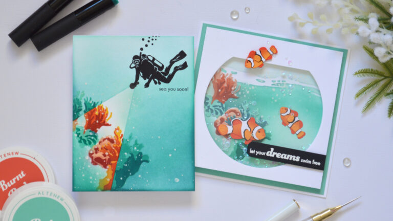
What if your card could feel like a window into an underwater world?
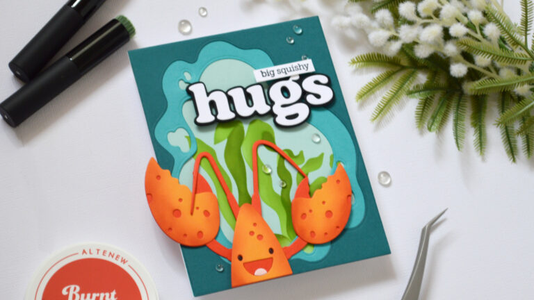
Make it snappy! Big die, Big Hugs, and one very enthusiastic waving claw.
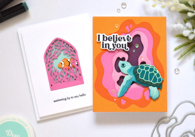
I may have become a little obsessed with creating open scene cards 🐠
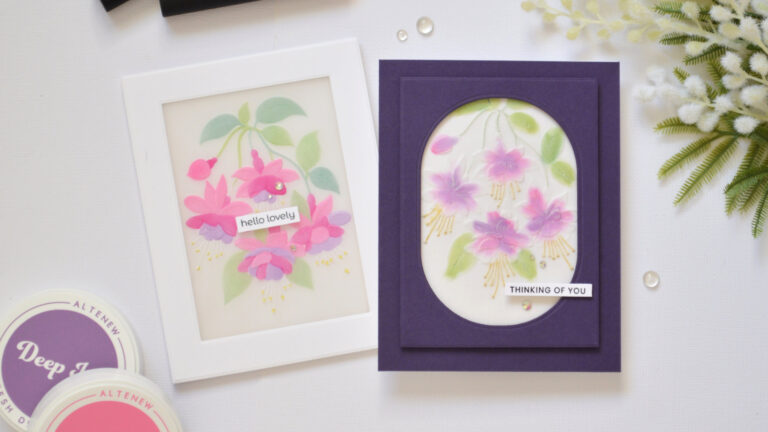
If you loved embossing on vellum, wait until you see what happens when you add colour!
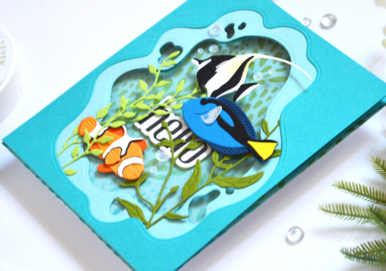
There’s something magical about being able to see through the layers of a card design